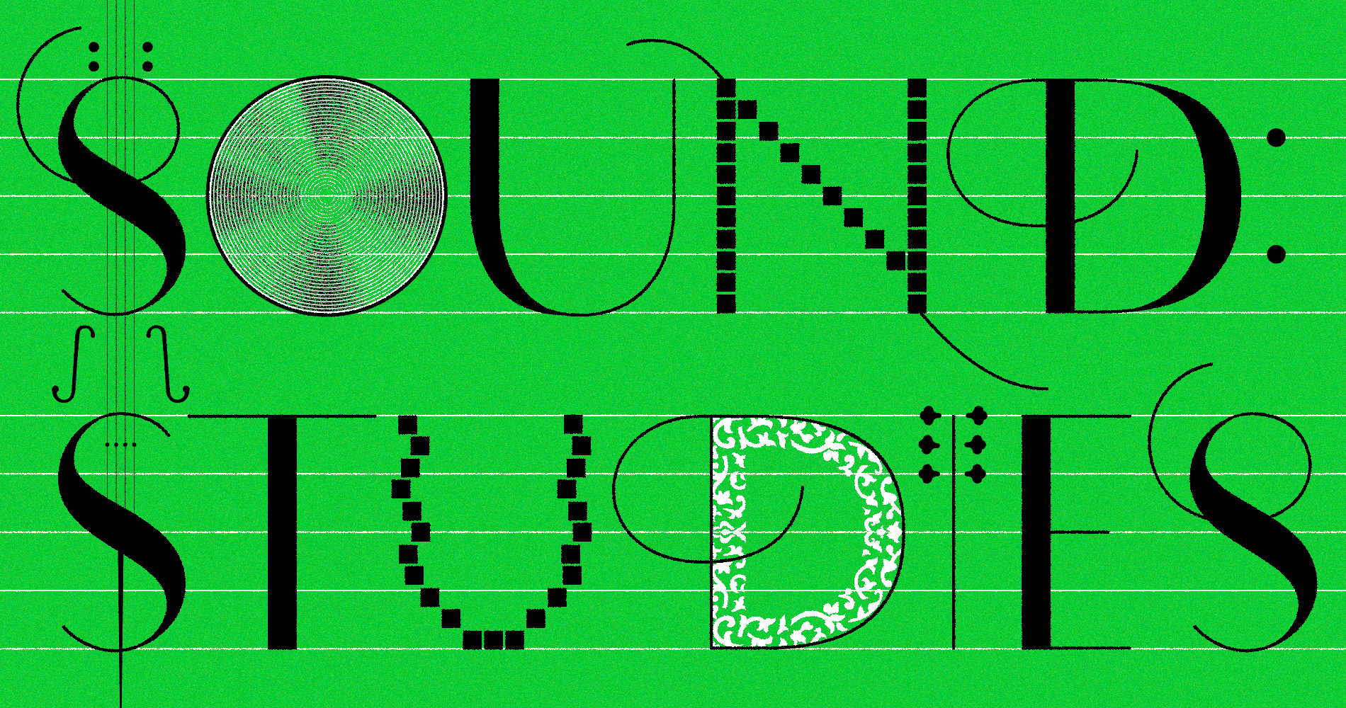
Hello, my name is Halim. I am a multidisciplinary graphic designer originally from Seoul, South Korea. I have a background as a mobile UX Designer at Samsung and completed my MFA degree at the Rhode Island School of Design.
By embracing diverse media, from print to digital, I strive to explore new possibilities in graphic design. I love to weave humor, storytelling, and poetic computation together, and utilize this mix to advocate for the power of positivity and brightness.
inter.gardeninthe.net
mov.gardeninthe.net
–24f.gardeninthe.net
–soft.gardeninthe.net
–24s.gardeninthe.net
–platform934.net
–gardeninthe.net
–toolsupsidedown.com
inscript.tf/2024
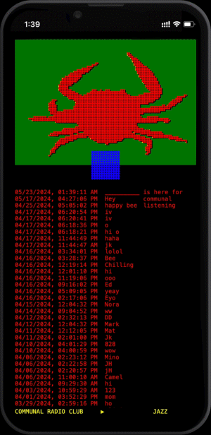
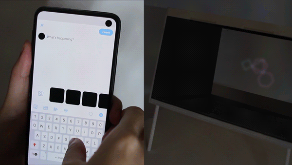
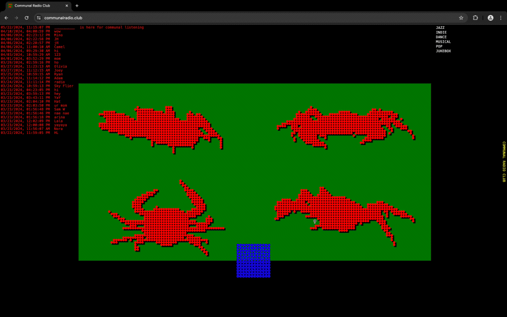
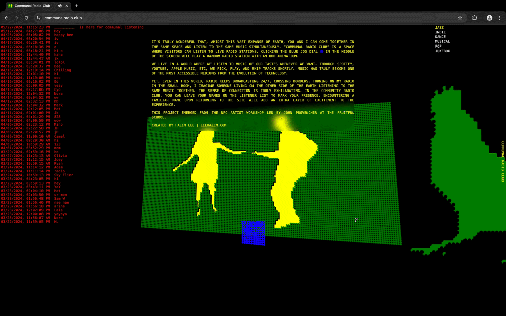
We live in a world where we listen to music of our tastes whenever we want. Through Spotify, YouTube, Apple Music, among others, we pick, play, and skip tracks at will. Music has truly become one of the most accessible forms of media from the evolution of technology.
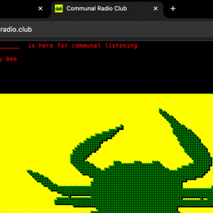
Yet, even in this world, radio keeps broadcasting 24/7, crossing borders. Turning on the radio in my small room, I imagine someone living on the other side of the Earth listening to the same music together. The sense of connection is truly exhilarating. In the Community Radio Club, you can leave your names on the listener list to mark your presence. Encountering a familiar name upon returning to the site will add an extra layer of excitement to the experience.
This project emerged from the NPC Artist workshop led by at the .
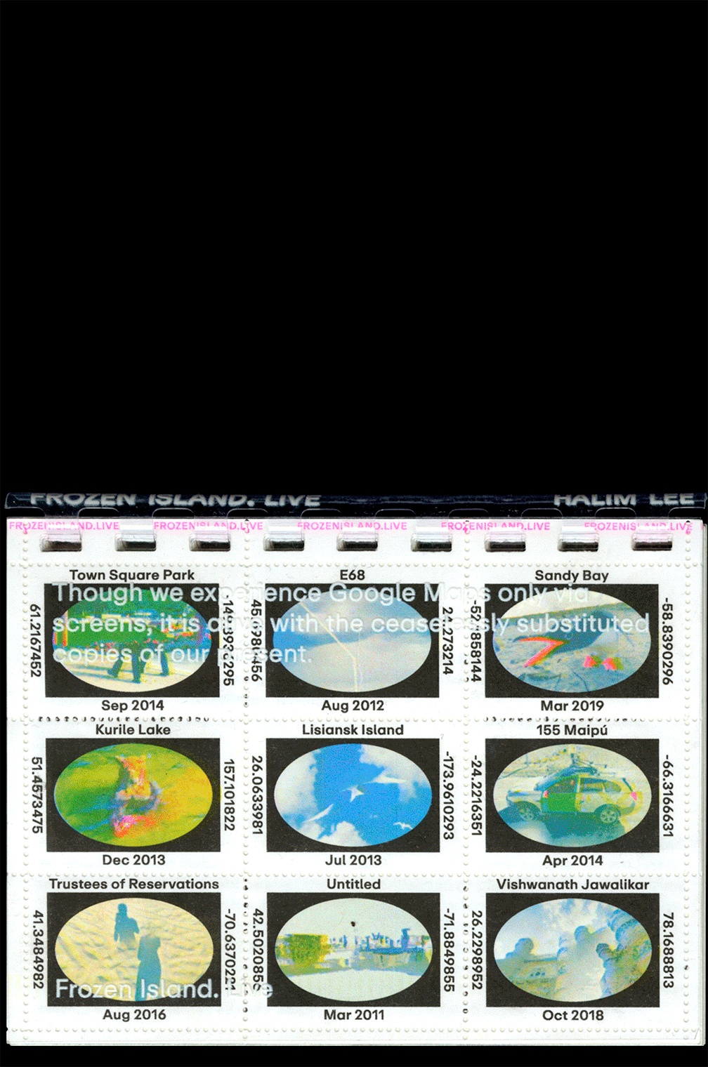
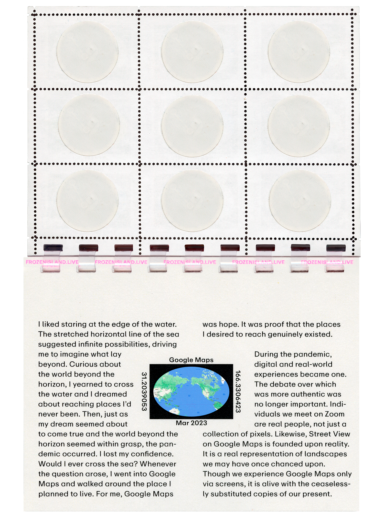
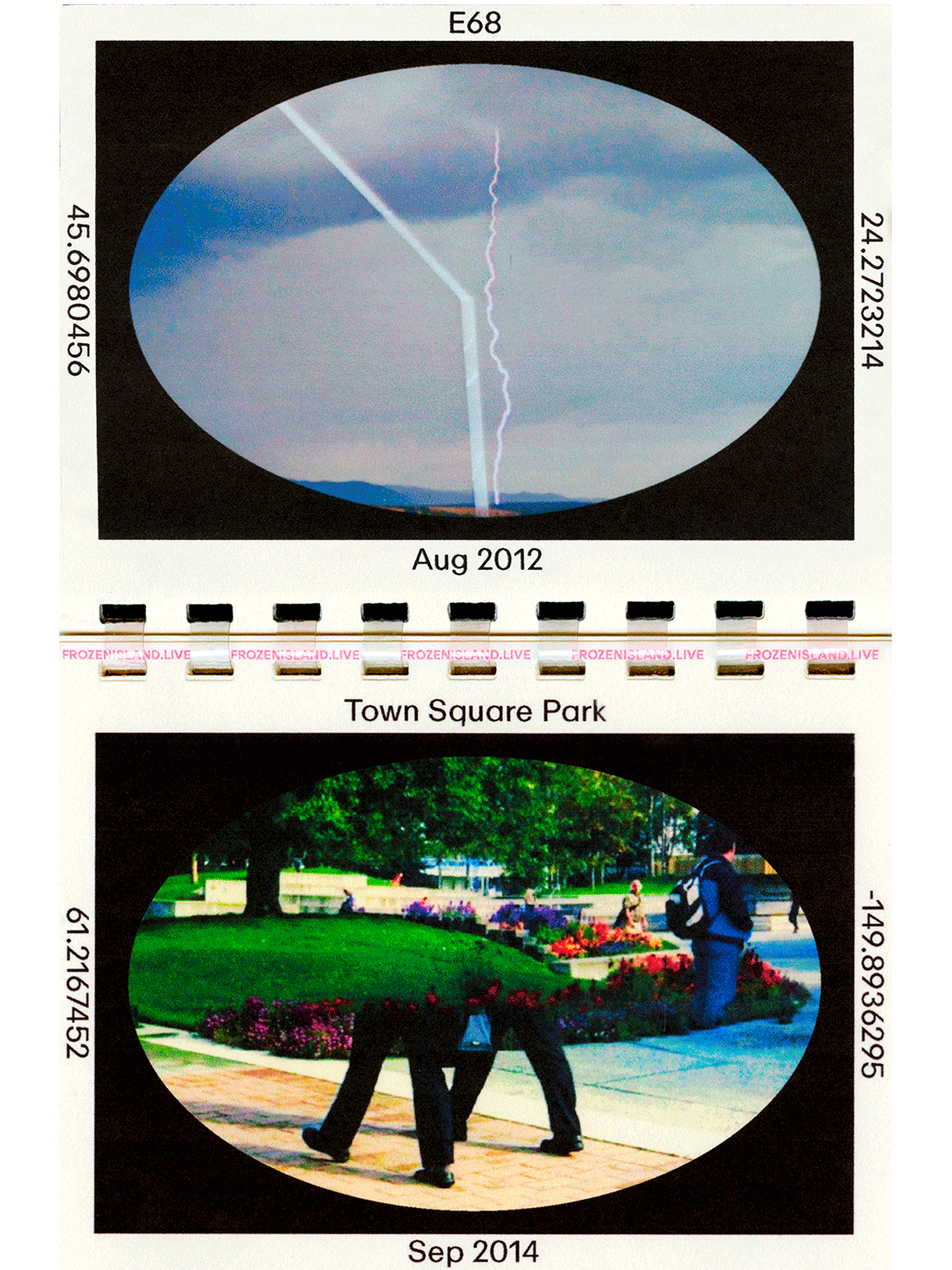
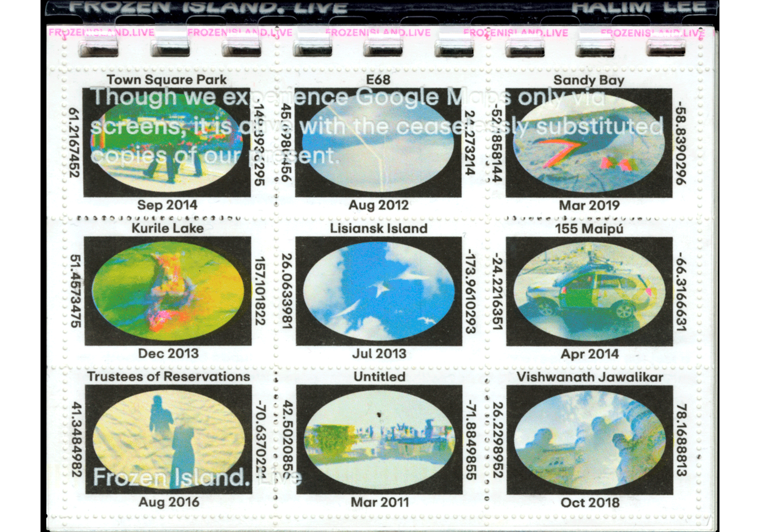
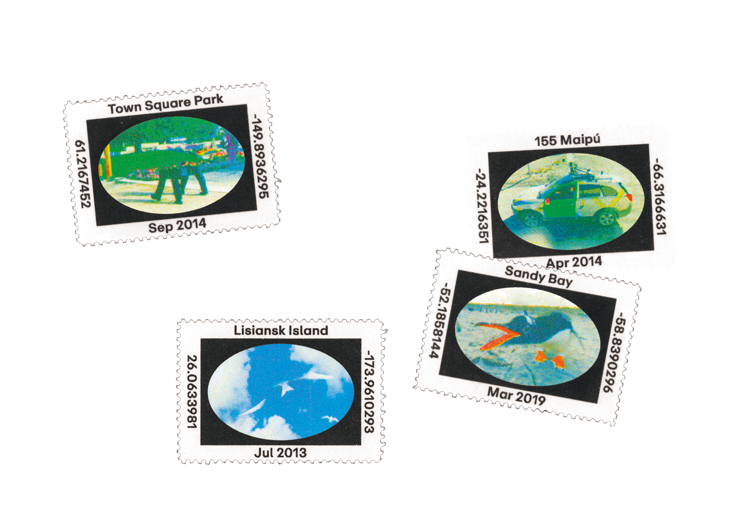
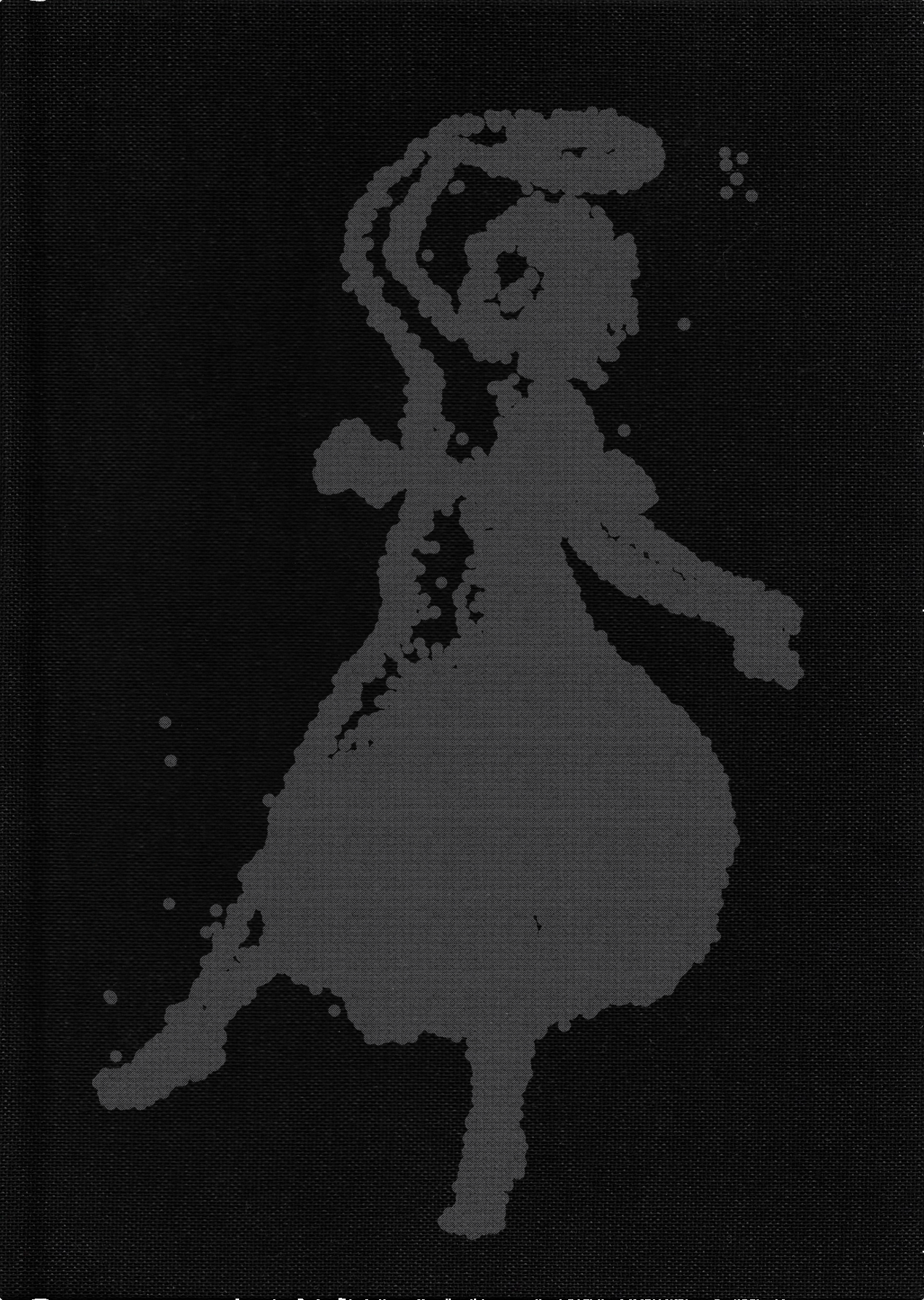
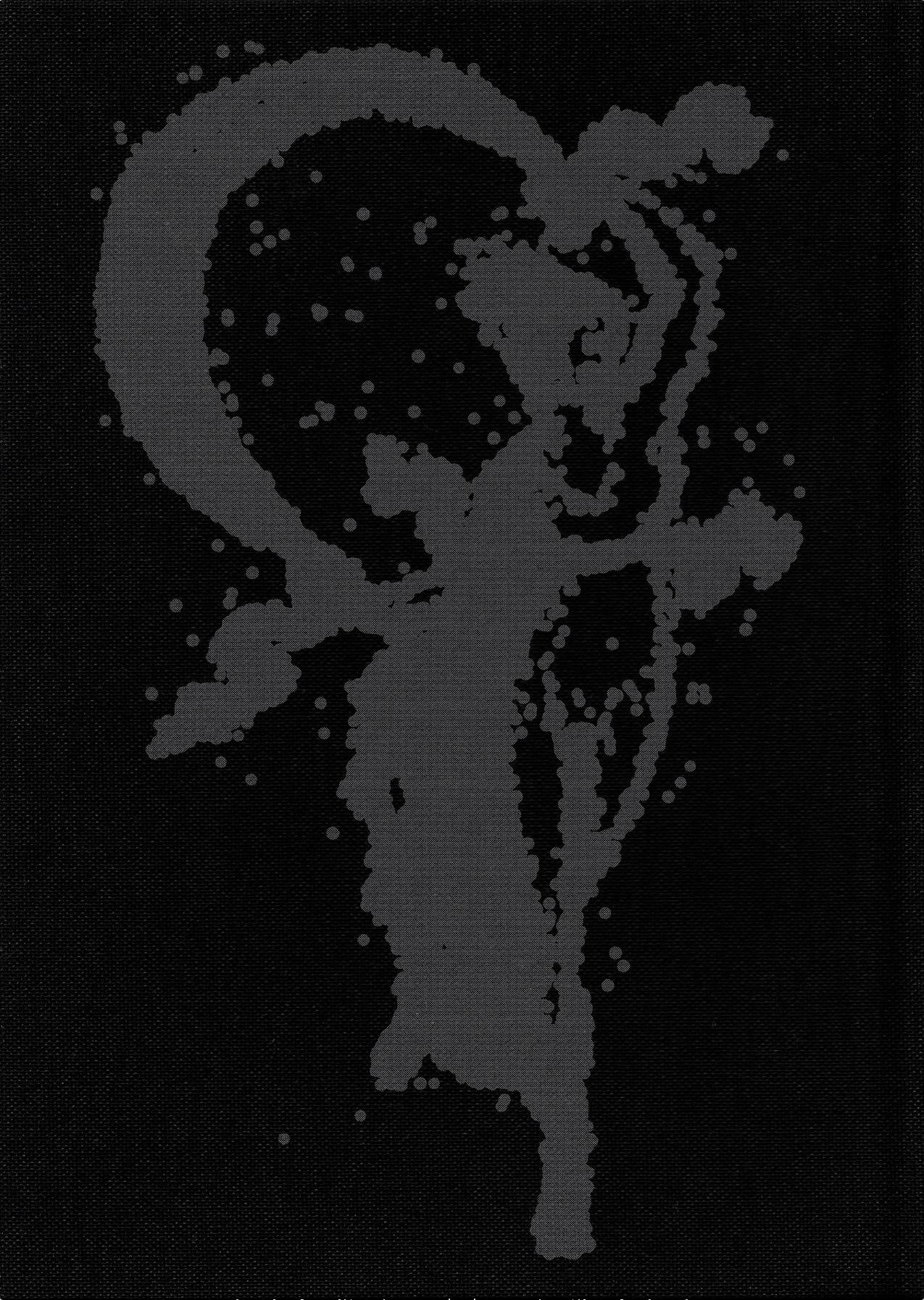
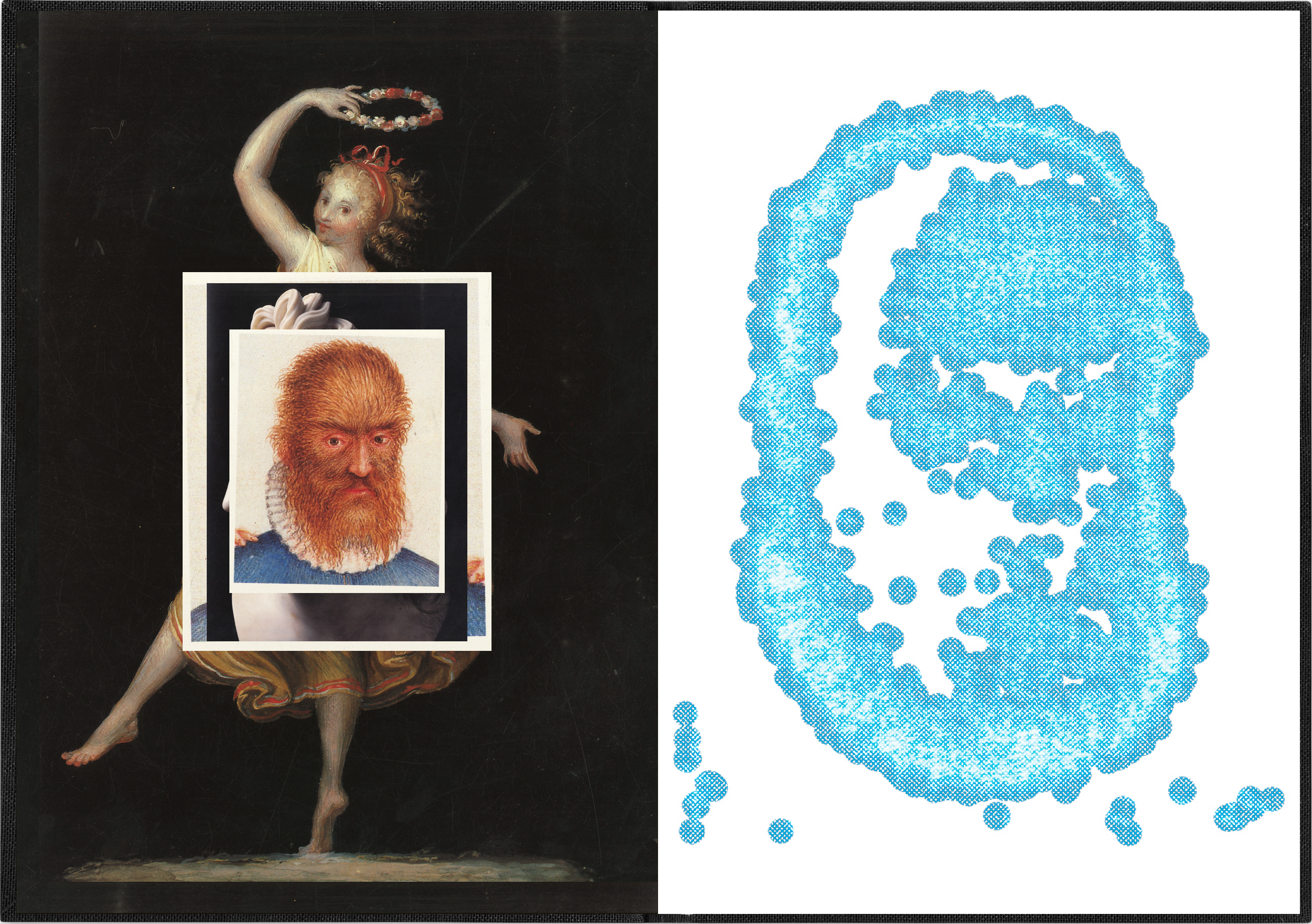
Each stamp is a mini-portal that takes readers to surprising moments on Google Maps. By tagging the stamp with their phones, people can travel to strange and beautiful places in the world.
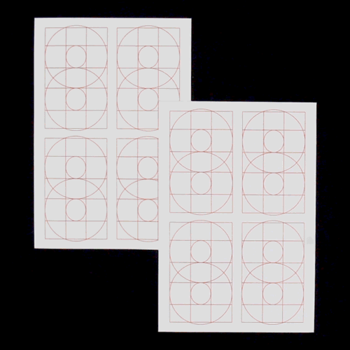
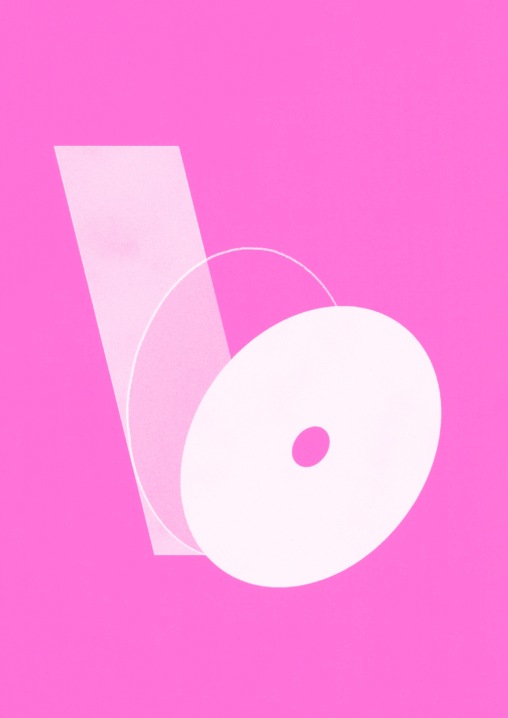
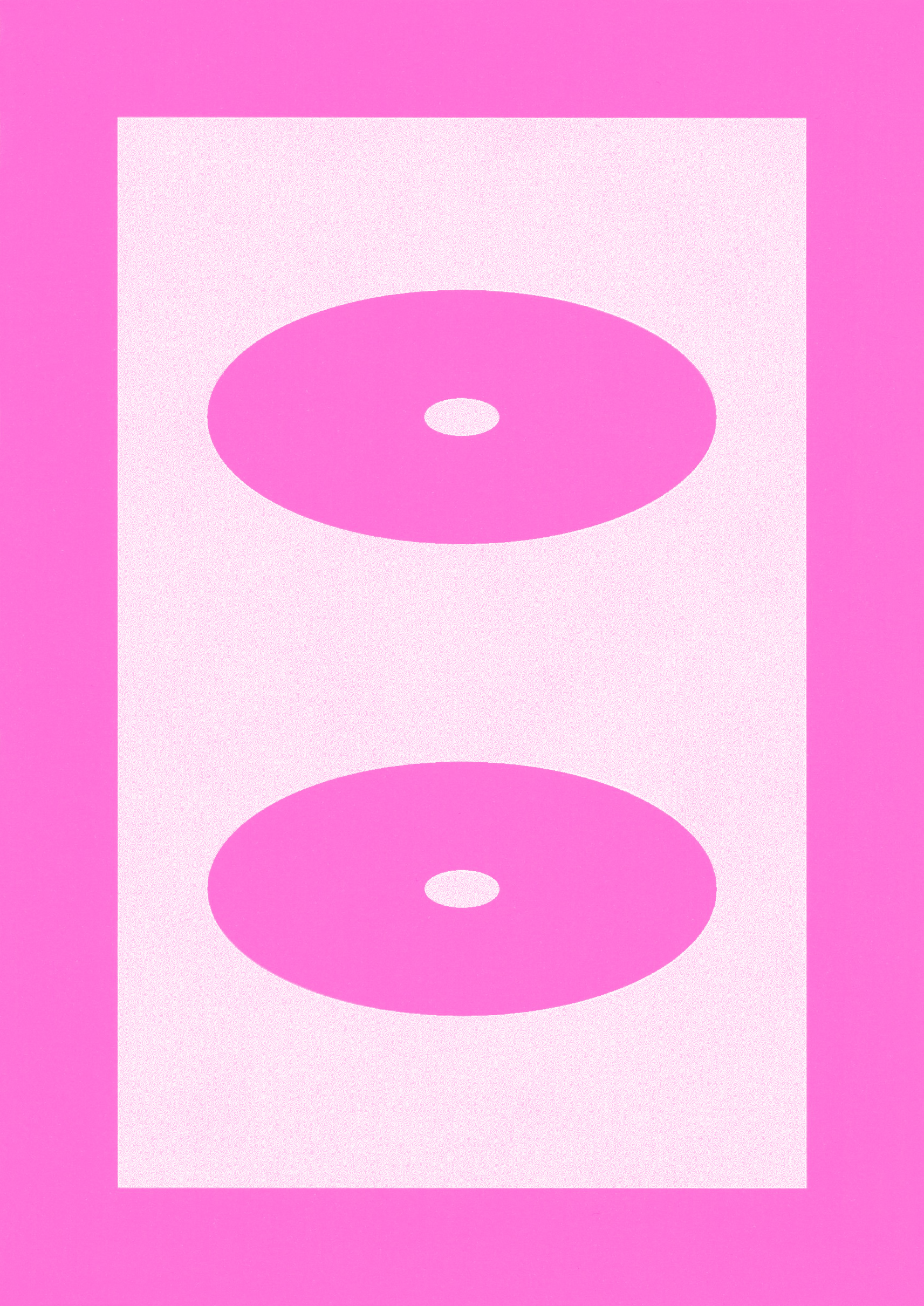
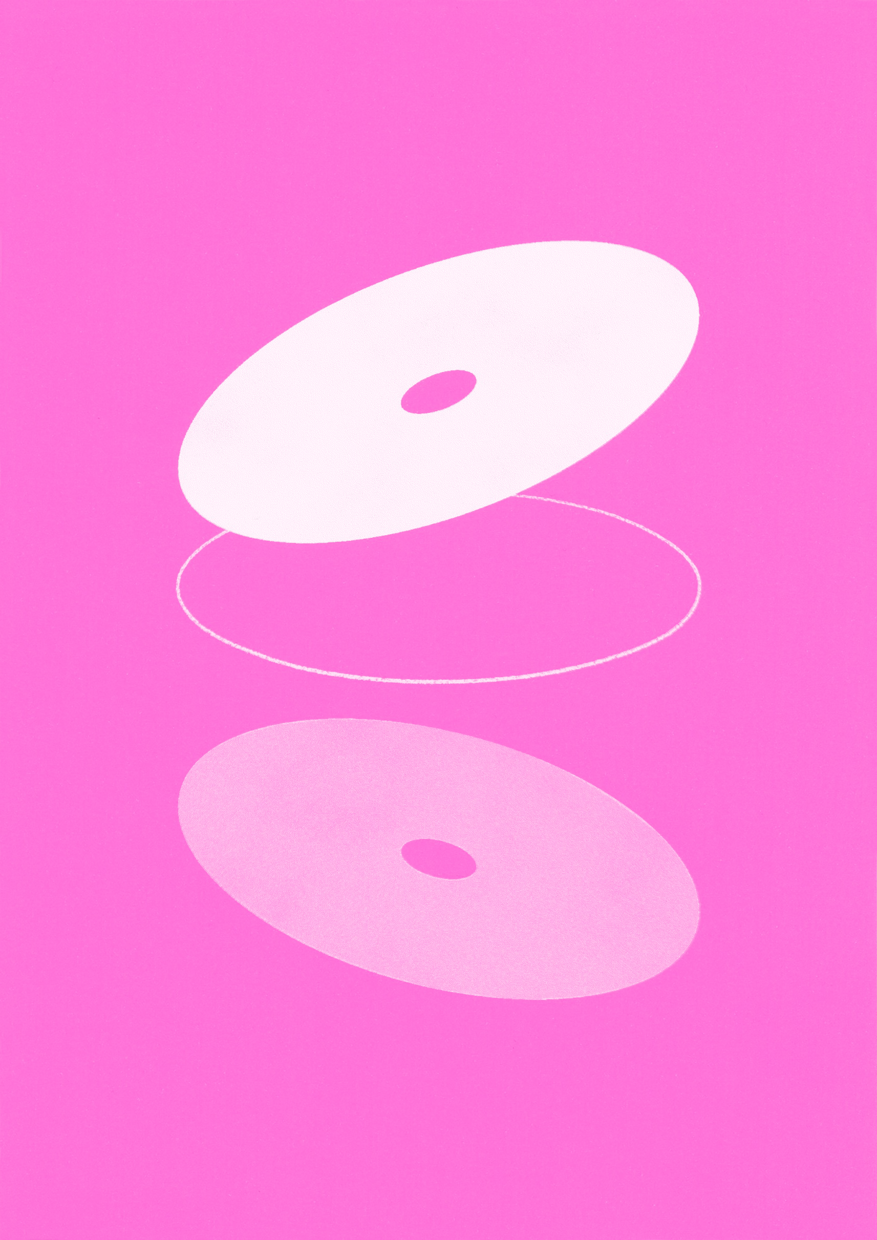
The oval circles used throughout “Frozen Island. Live” are indicative of the Earth, the viewing eyes of users, and the idea of a portal.
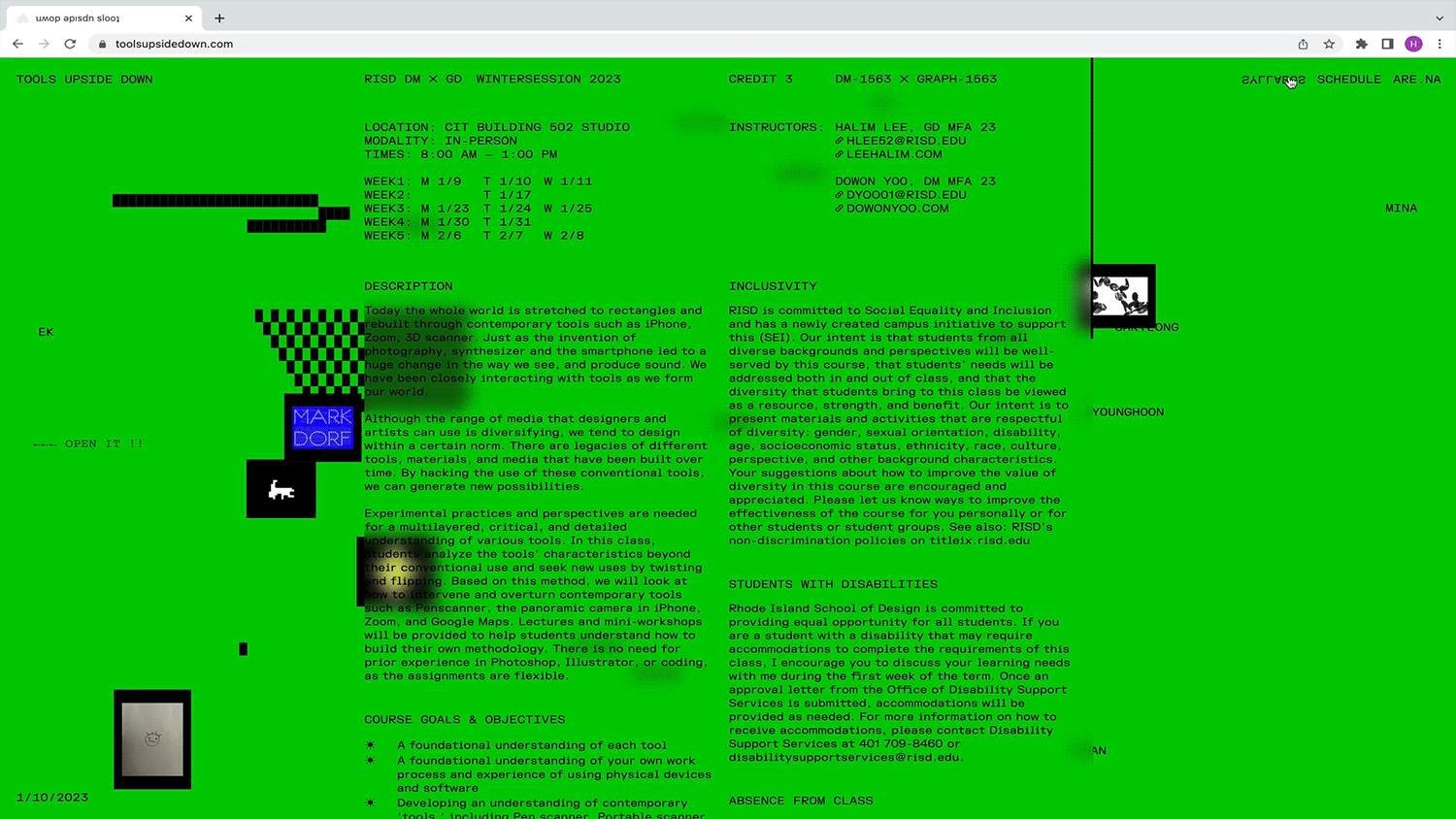
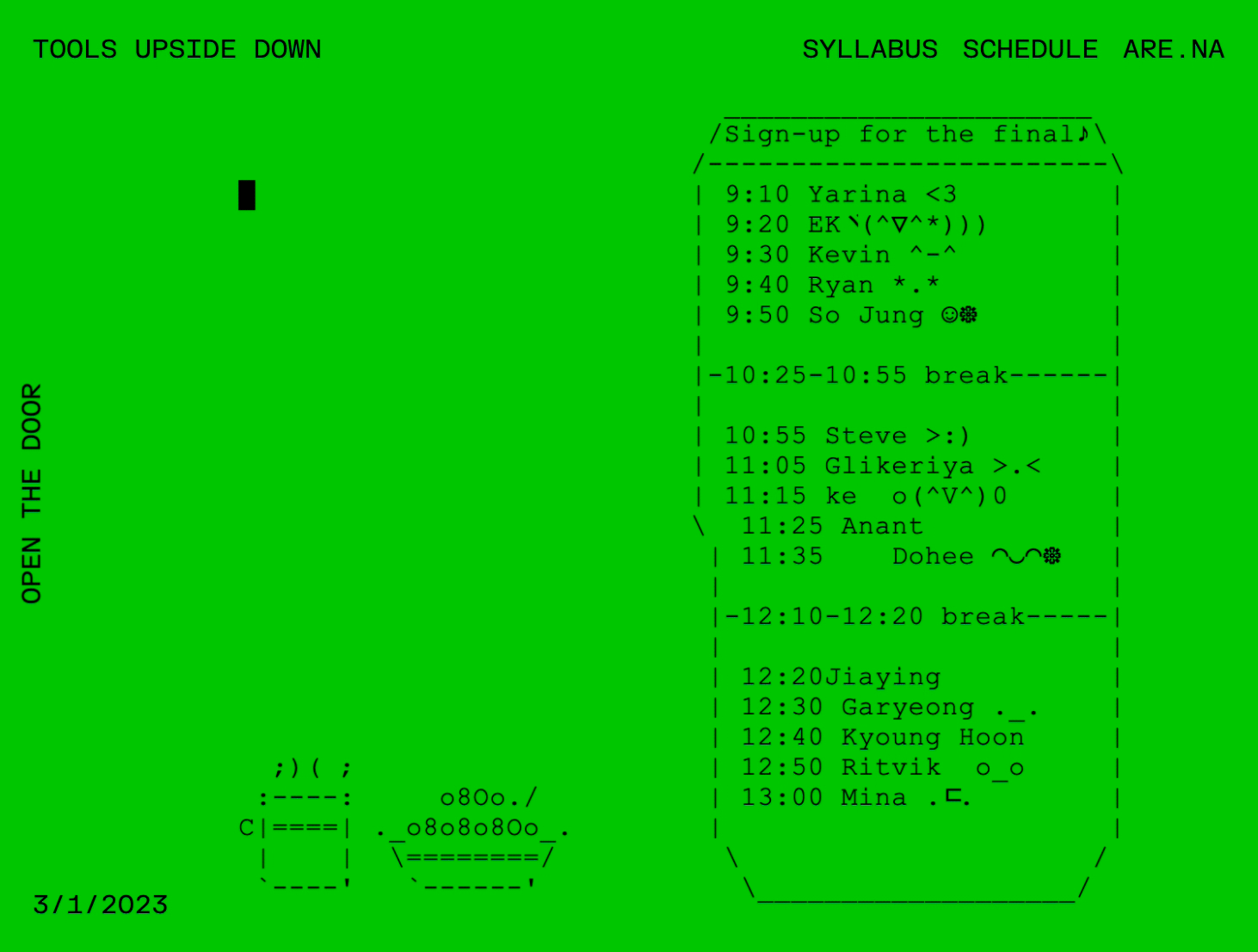
As an open canvas, anyone can type what they want on the website. During the class, it was used as a chat room, drawing tool, sign-up sheet, Q&A, and a space to complain about being hungry. Further, this website encourages visitors to connect with students and their work. When visitors click on the names floating on the website, they can visit students' Instagram pages.
In addition to these social purposes, it was utilized as a shortcut to collect class materials that are scattered in Google Drives and Are.na.
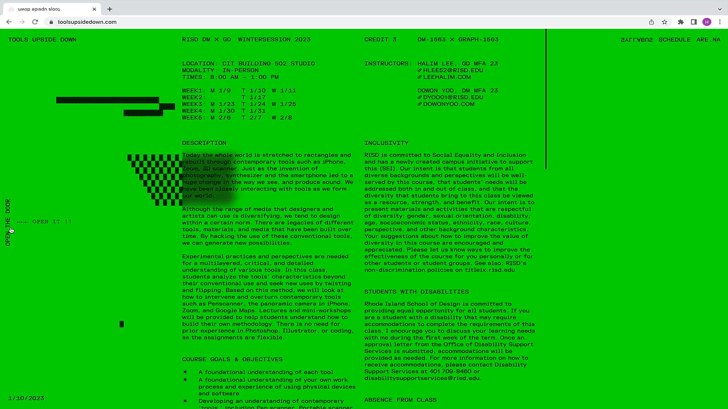
Course Description ↓
“Tools Upside Down” discovers new ways to use tools by hacking, twisting, and flipping them. Including contemporary digital tools, students will be encouraged to bring the tools from their own fields of expertise. By exploring and subverting all the tools we use, the course places a strong emphasis on experimental processes and outcomes.
Co-taught with
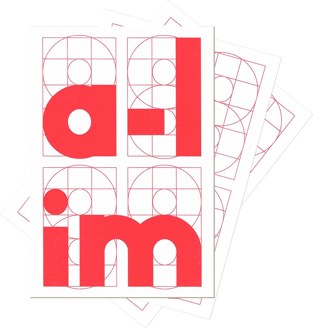
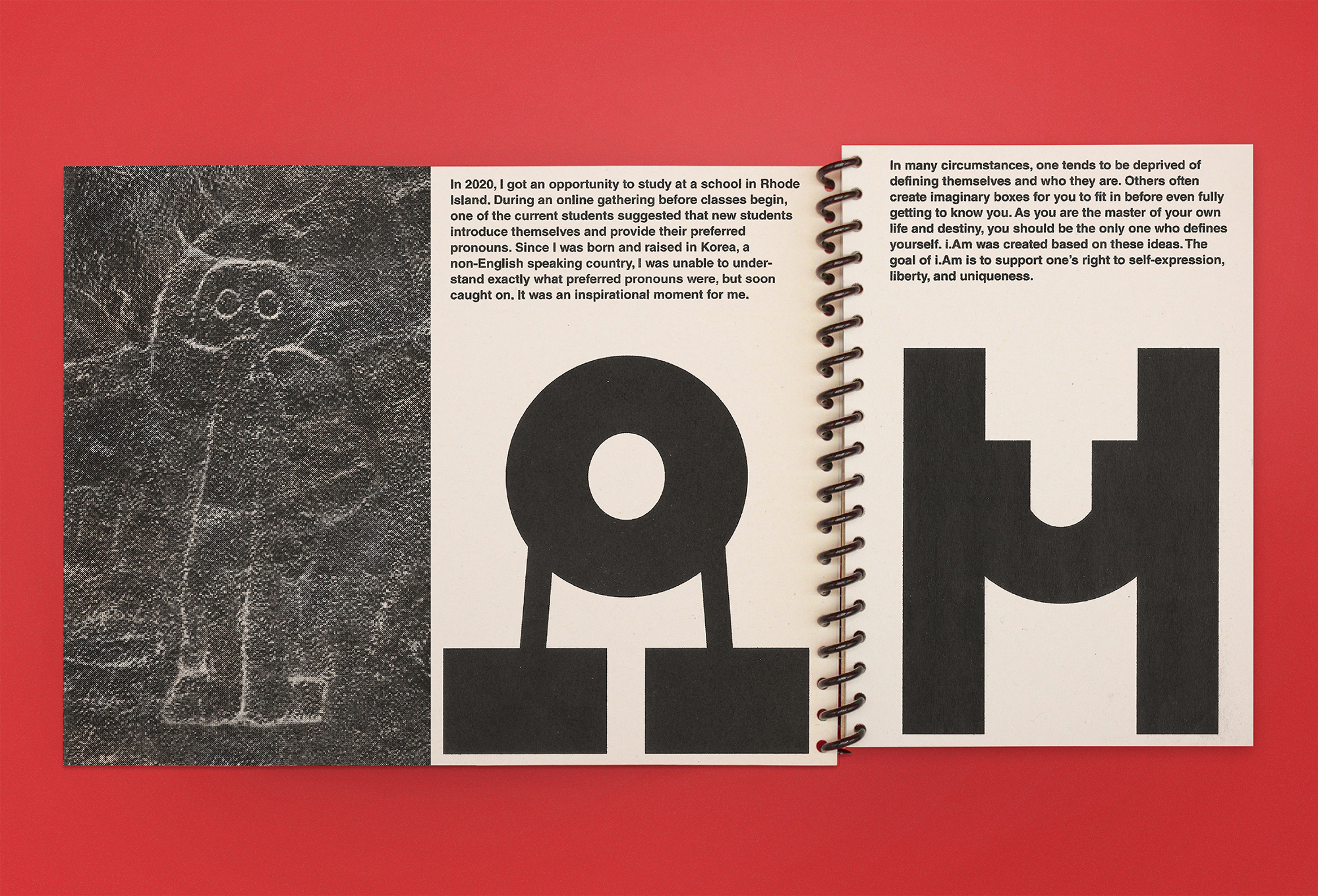
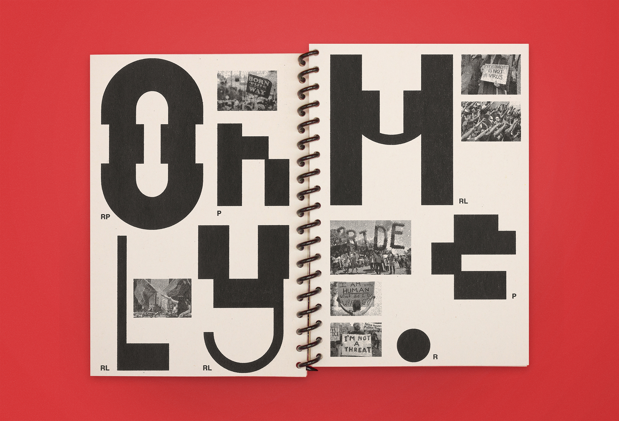
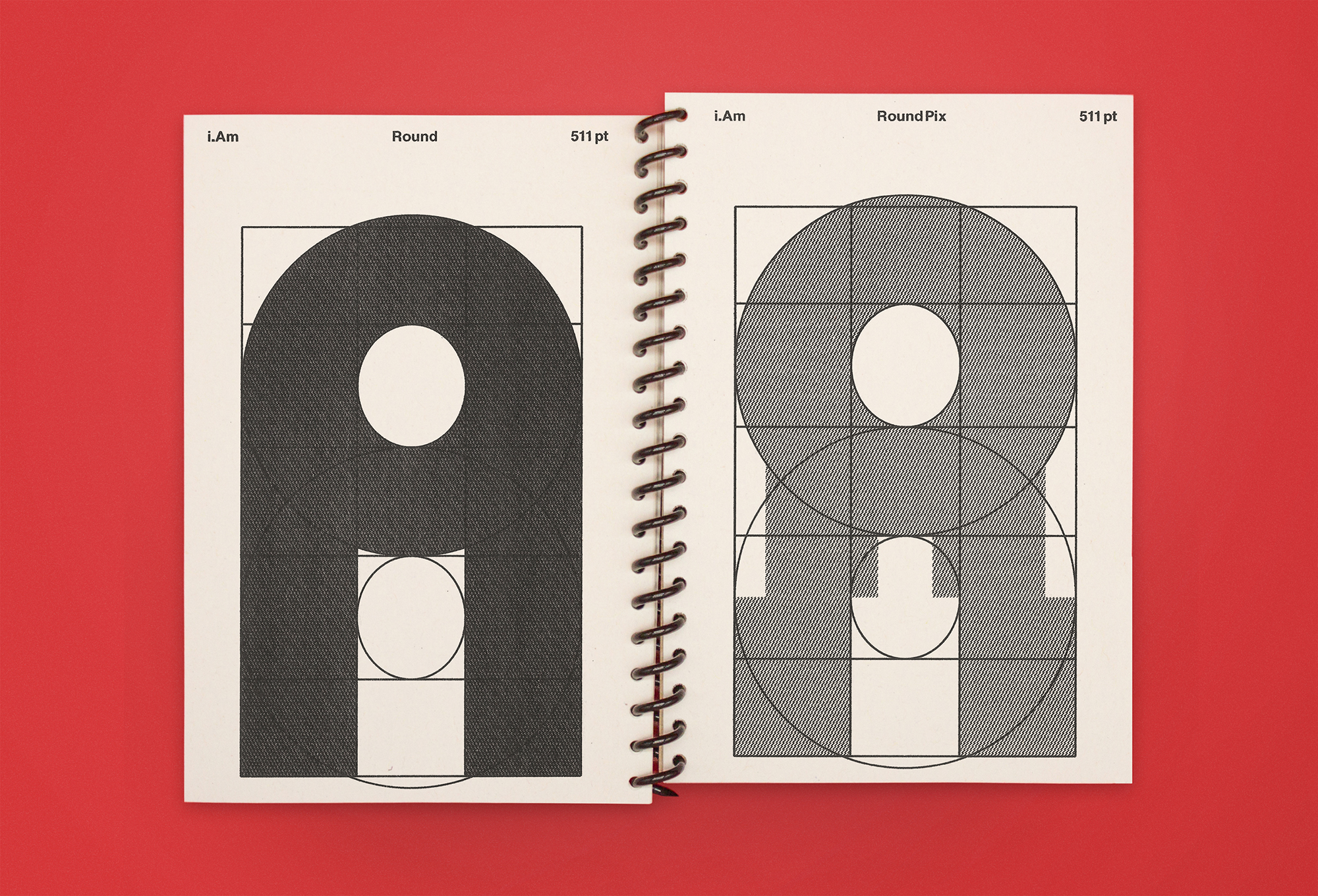
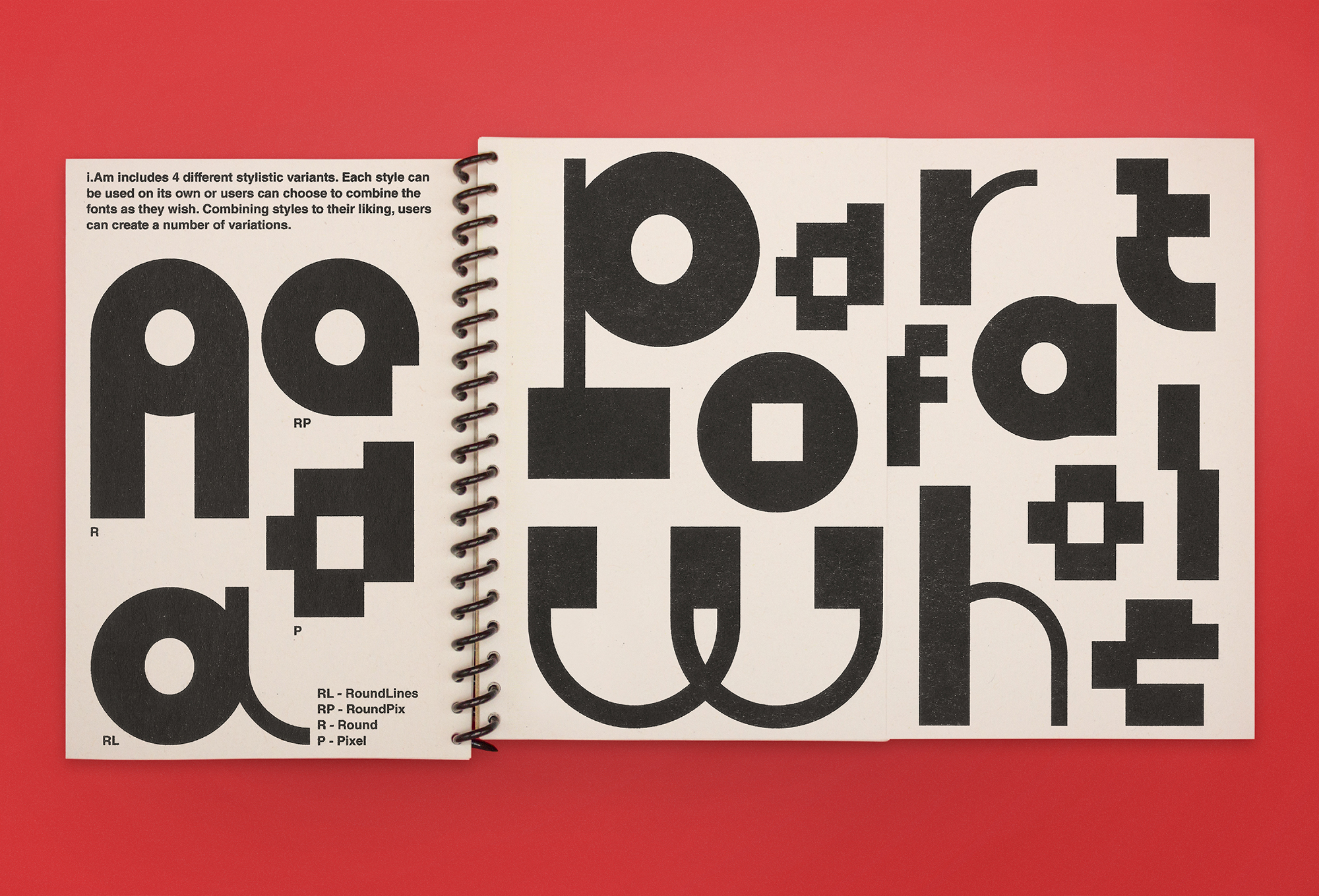
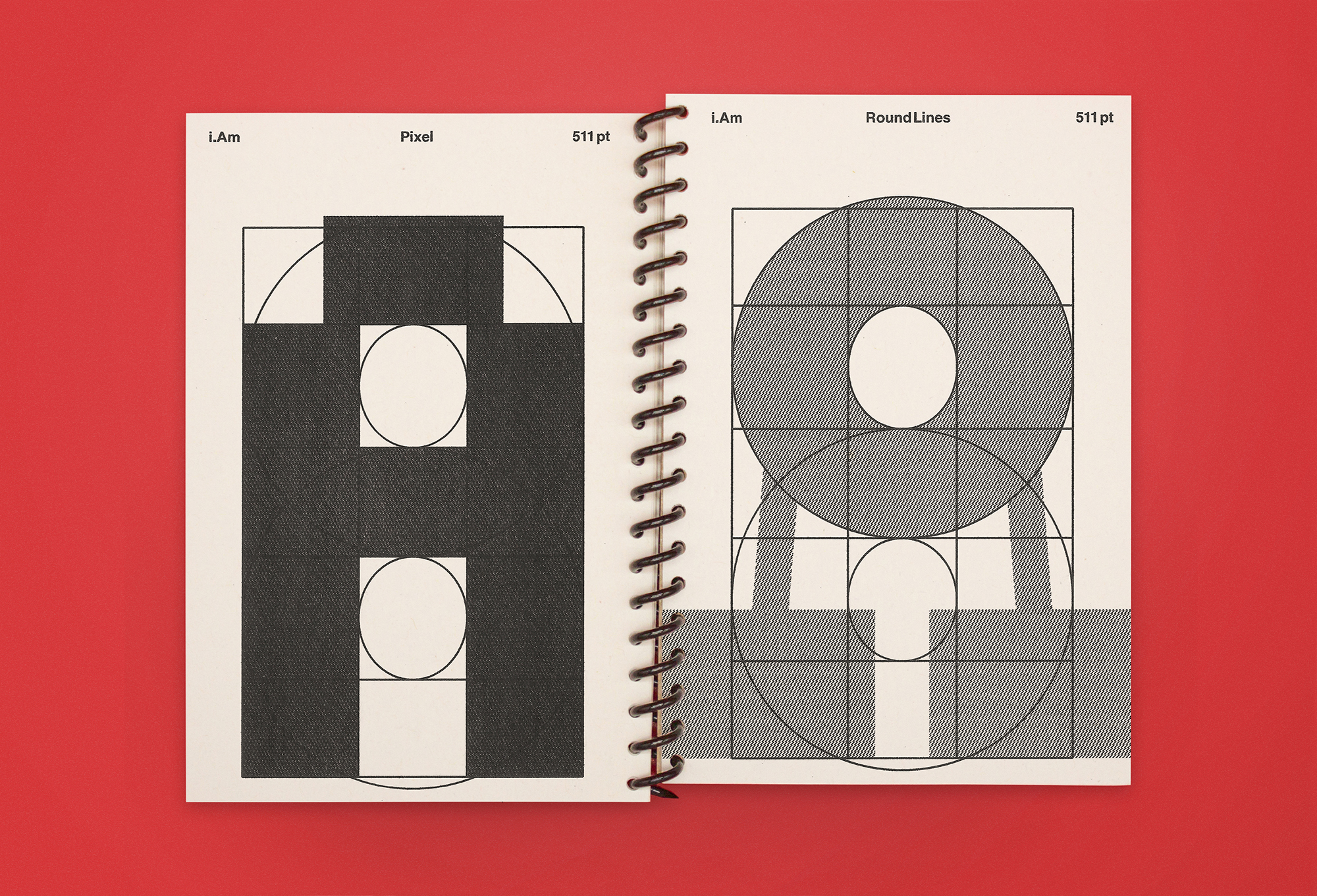
My font called “i.Am” supports one’s right to self-expression, liberty, and uniqueness.
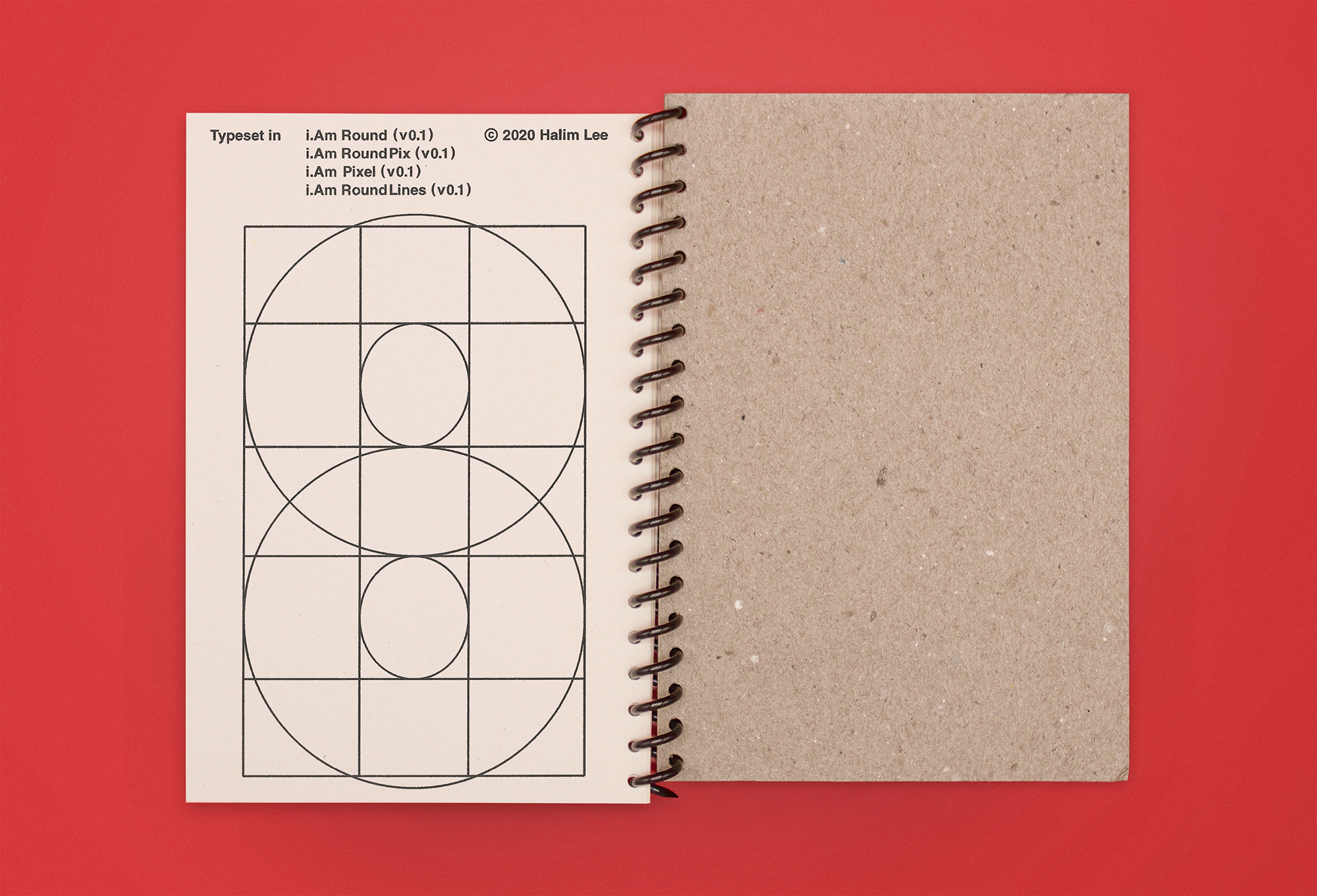
This piece was honored with the Certificate of Typographic Excellence at TDC 67 Communication Design Competition.
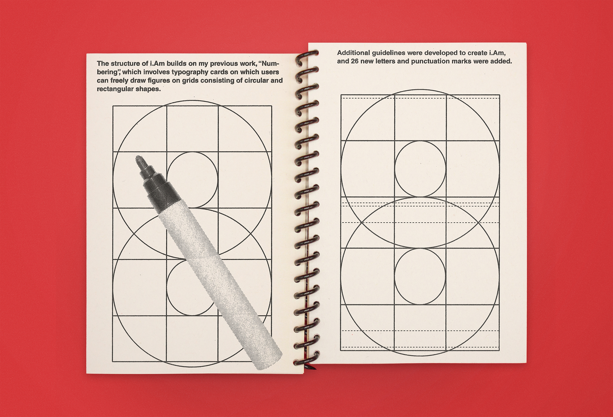
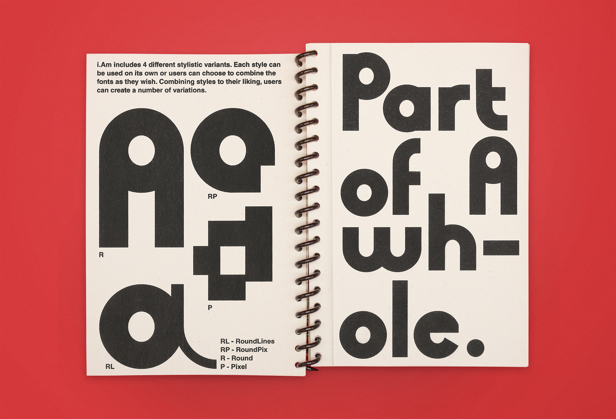
i.Am은 4가지 서로 다른 스타일을 섞어 사용할 수 있는 레이어드 폰트이다.
우리는 종종 타의에 의하여 우리가 원하는 모습과는 다르게 규정됩니다. i.Am은 "i.Am only me."의 슬로건을 바탕으로 스스로가 정의 내리는 "나"를 지지한다.
TDC 67의 Certificate of Typographic Excellence으로 선정되었다.
Category: Book Typography
Year: 2020
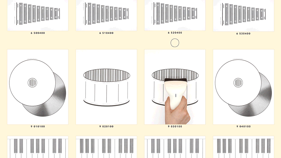
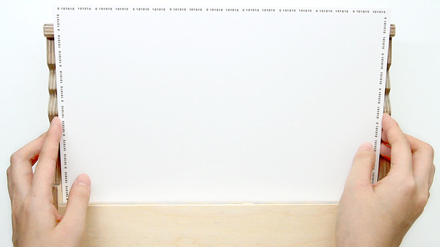
The barcodes are made of ink and printed on paper. However, when they are scanned, the scattered ink is transformed into a non-physical form of sound. Digital codes compress lots of data into a single easily scannable form, enabling vast amounts of information to be quickly accessible. I believe this is the essence of digitization. This new digital instrument compresses the heavy musical instruments onto a single piece of paper, exemplifying the core of digitization.
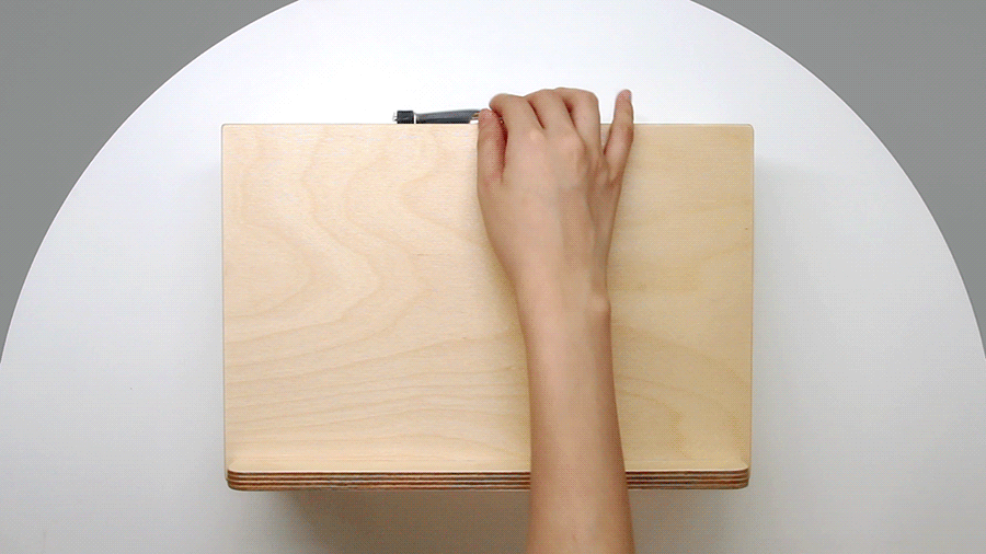
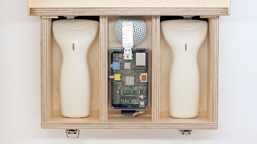
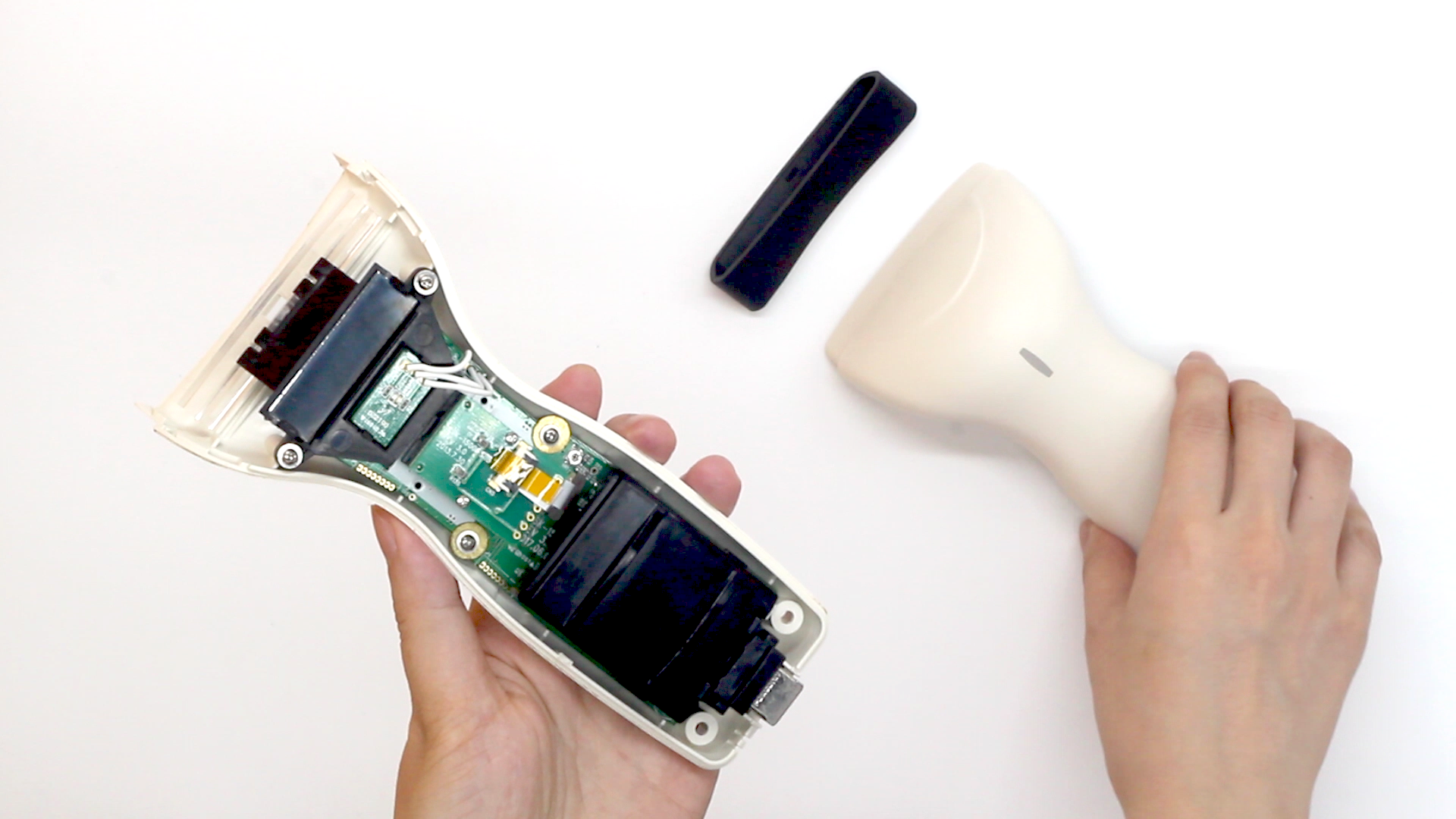
was made in 2012 with Woonjin Kang and Yongduk Kim. This is the project that I later developed into a portable version.
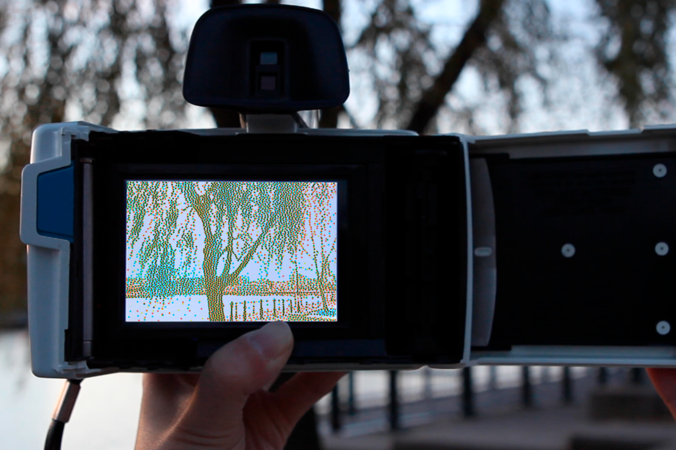
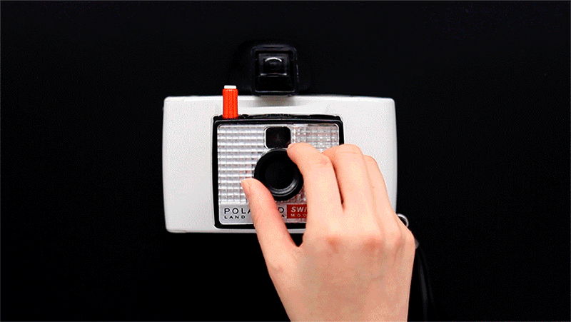
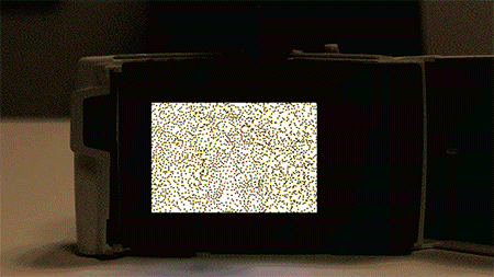
Today, one of the most common and ordinary image-making tools is a camera. I applied the same concept of “combination” and “separation” to my own project and created a camera that automatically separates RGB color plates from the photographs to generate new images.
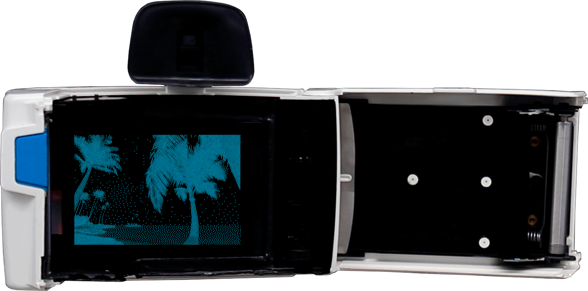
To show generated images, I mapped three different projects of red, green, and blue lights. The lights from the projectors were overlaid on top of one another to generate a full-color combination.
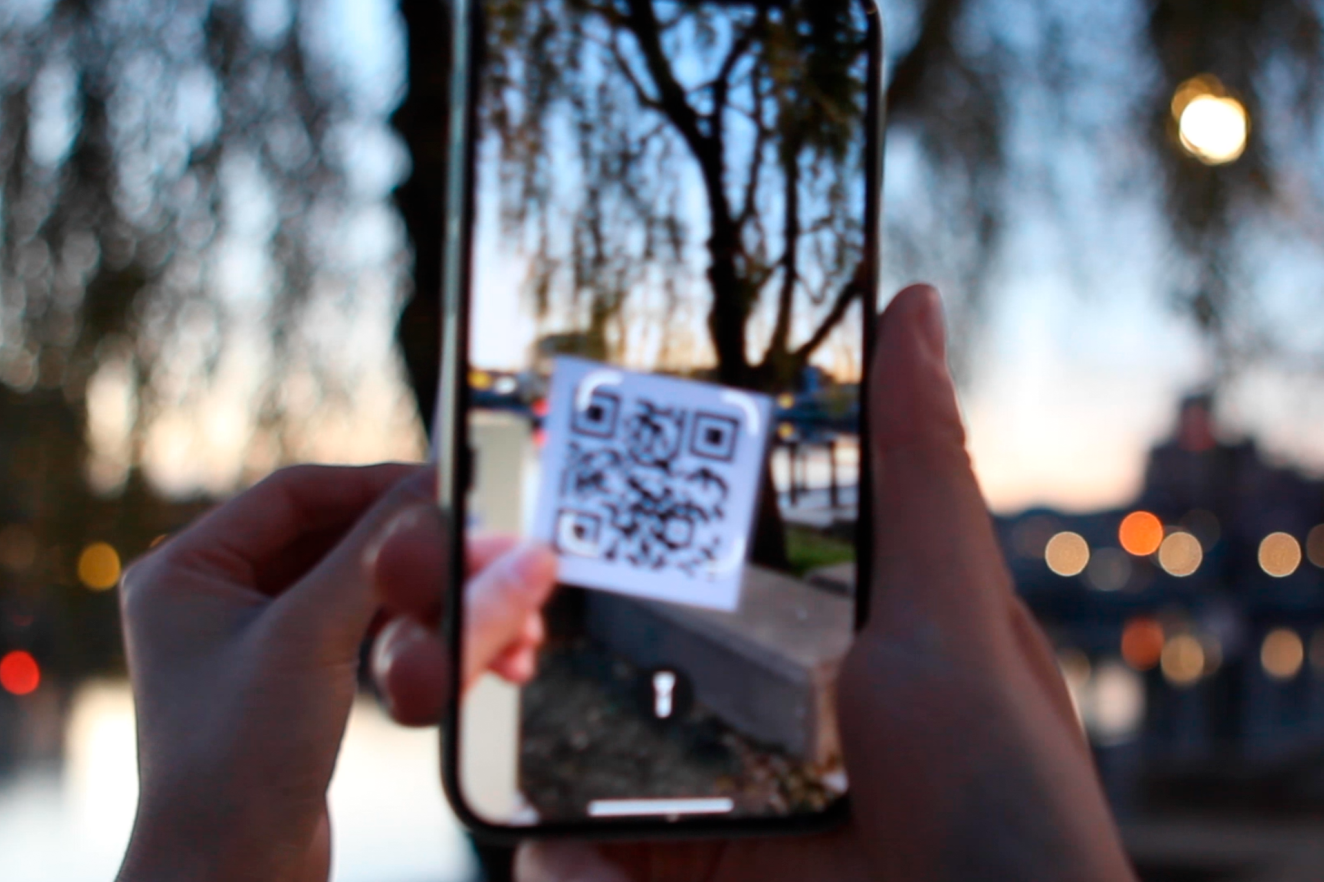
The generated images are uploaded to my dropbox, where anyone can download them by scanning the QR code.
The yellow hand at the center of the logo rotates 360 degrees and forms the shape of the sun.
I took photos of the alphabet with my iPhone. While zooming in and out of the photo, I found that the arrangement and the transition of the typeface on the app were visually satisfying. I then made my own compositions from this idea.
For the second practice, I applied a little glass to the app and generated pixelated images. In order to represent the aesthetic of the practice, I created a script that can generate pixelated images and applied the code to the compositions created in the first practice.
From the idea that “able” looks like rubber bands, I made a webpage where users can play around with the font. The width of “able” changes with the movement of the user’s mouse, and whenever users hit the Random button, a random word and image related to the versatile uses of rubber bands pop up.
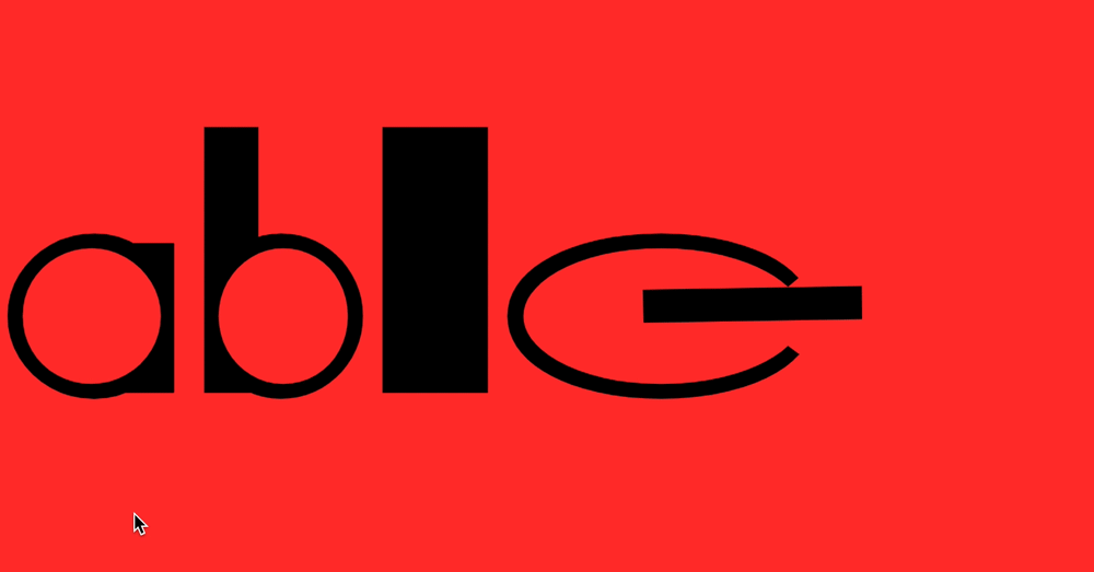
Every single page can be printed as a postcard, and the original website where the images were downloaded can be shown when the mouse moves to the bottom-right most area.
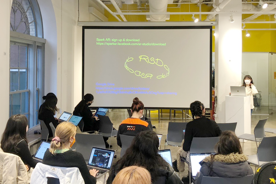
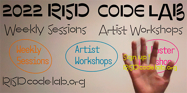
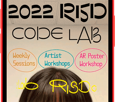
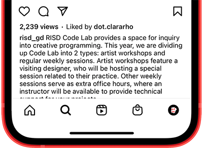
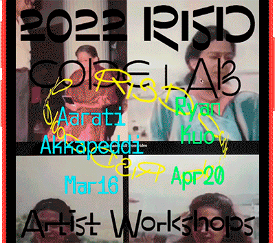
The initial idea was to design a poster using text in a programming language and the text turns into fun AR graphics when the poster is scanned via smartphone. In order to increase readability, the idea was changed in the final version, but the key concept remained the same - “Programming is not intimidating but intriguing.”
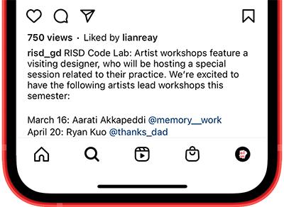
As most design students think that coding is hard and difficult, I tried to emphasize the fun and exciting factors of coding. I used bright and playful graphics so that students can participate in the Code Lab without any burden.
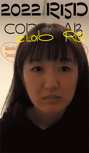
As the faculty members liked the idea, they asked me to lead an AR Poster Workshop.
The AR face filter below was used as a demo for the workshop. The slogan of this was “For beginners, all you need to bring is a smile!”. When you smile on this filter, a little cat emoji appears on your face.
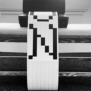
Each letter was designed by using Google Sheets and then printed out with a home printer. I glued the edges of the papers together, put the connected papers into the printer, and hit the print button while making a loop of the papers.
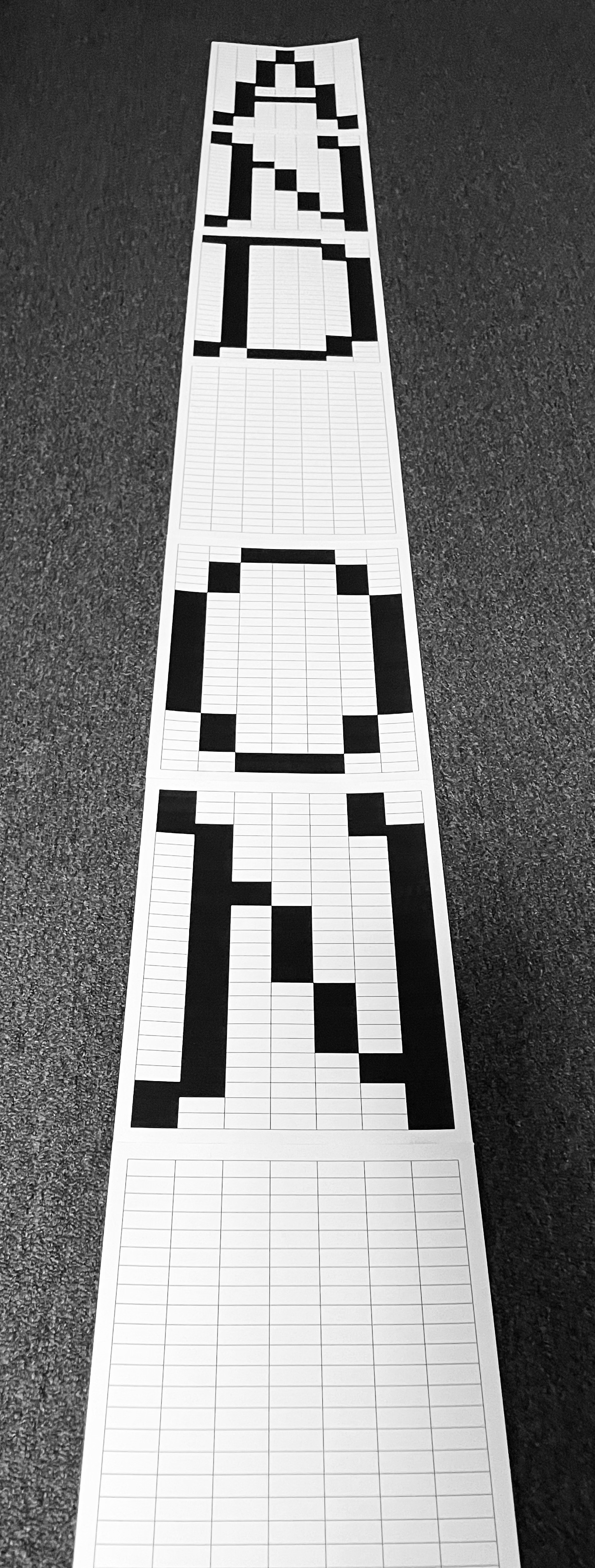
As a printer does not recognize the end of the loop, it continuously prints, and the letters of the expression “And On And On” automatically go through the printer over and over.
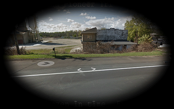
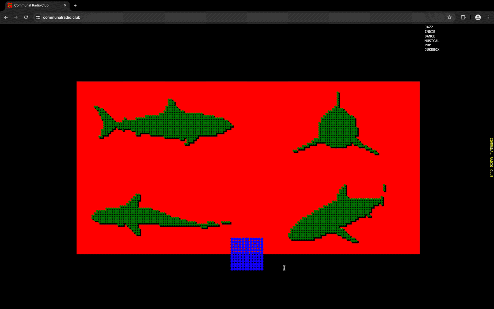
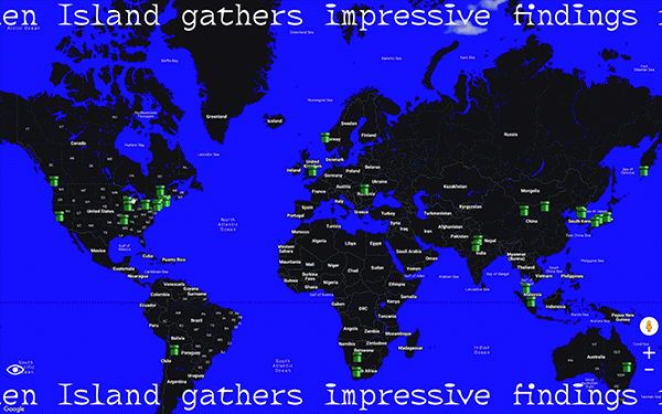
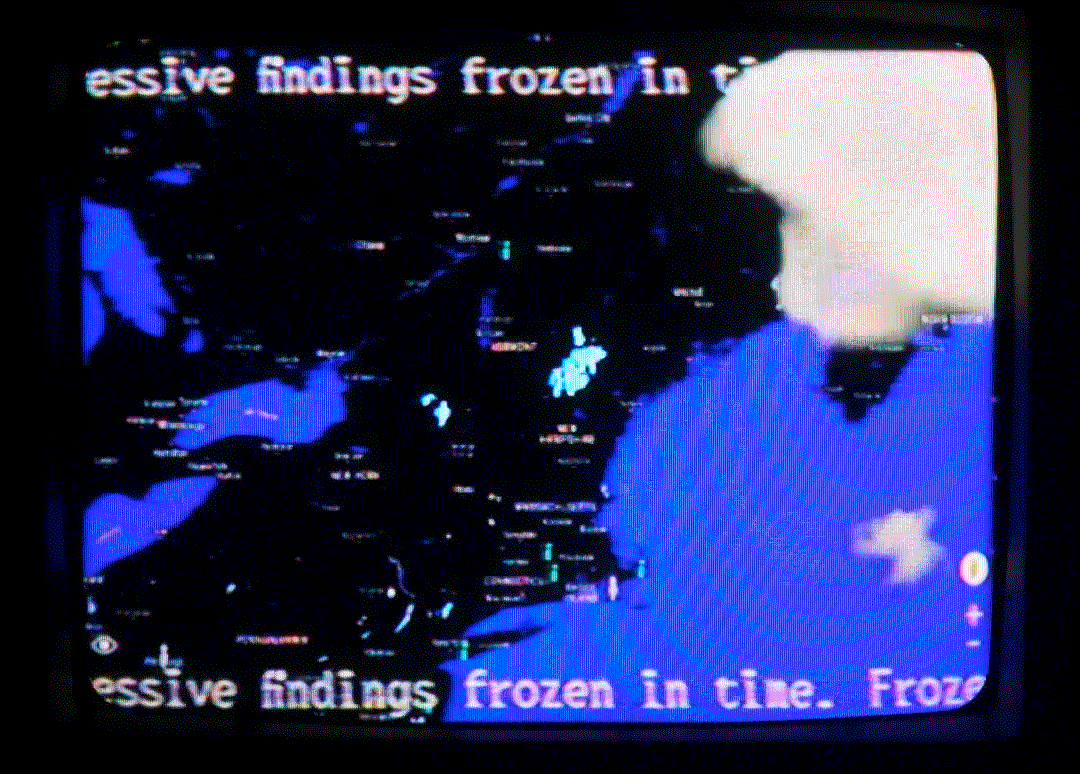
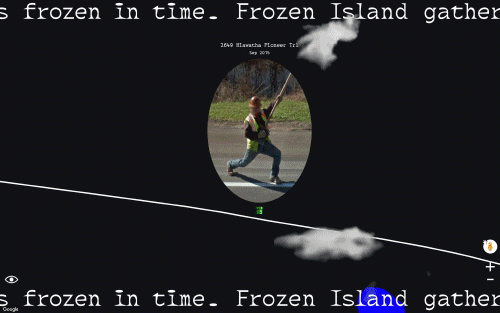
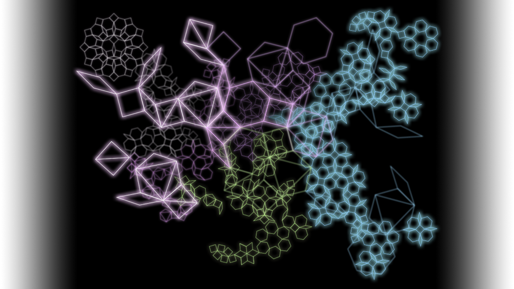
This project was created as a website but was also displayed on an old TV. Using a joystick, users can manipulate the Google Maps avatar and explore the island, just as though they were playing a video game.
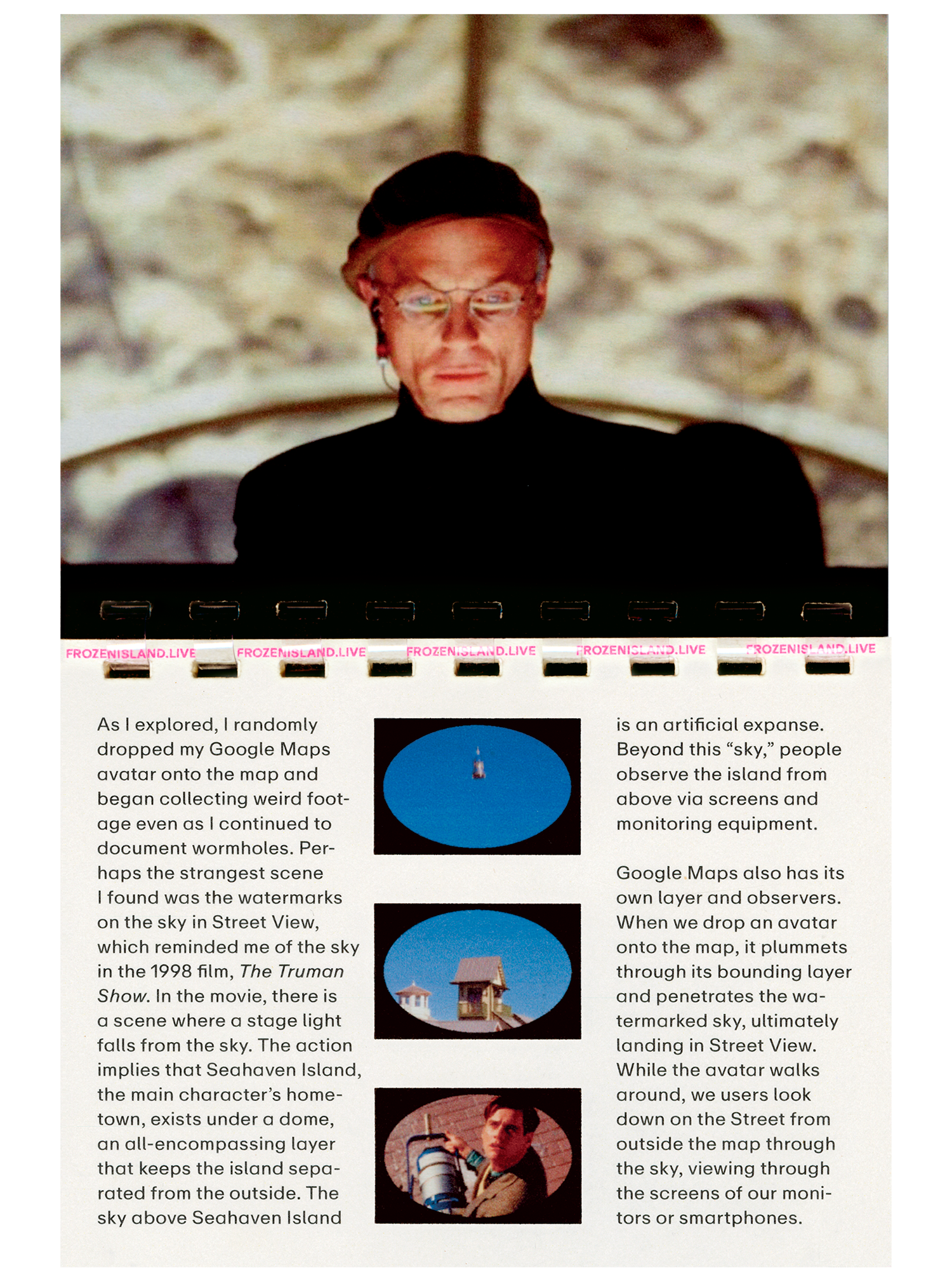
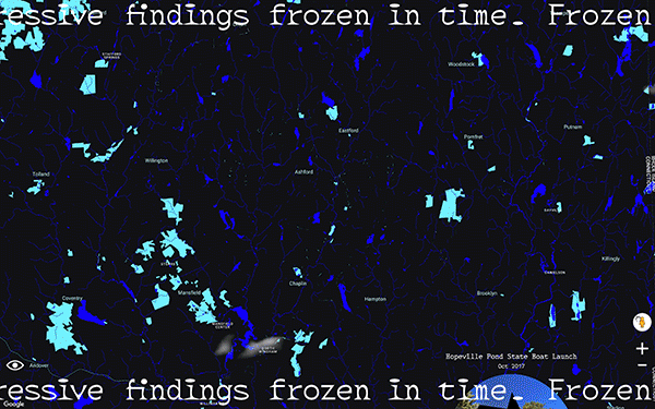
 This project initially began when I found watermarks on the sky of the Google Maps Street View. It reminded me of the fake sky in the Truman Show. In this movie, Seahaven Island where Truman lives consists of a mixture of the second and third dimensions. Although Seahaven Island is a three-dimensional real world, it is projected and broadcast as two-dimensional on TV screens. In the same way, Frozen Island exists as a growing archive behind 2D screens.
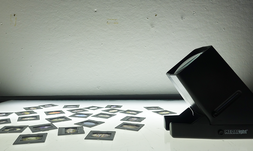
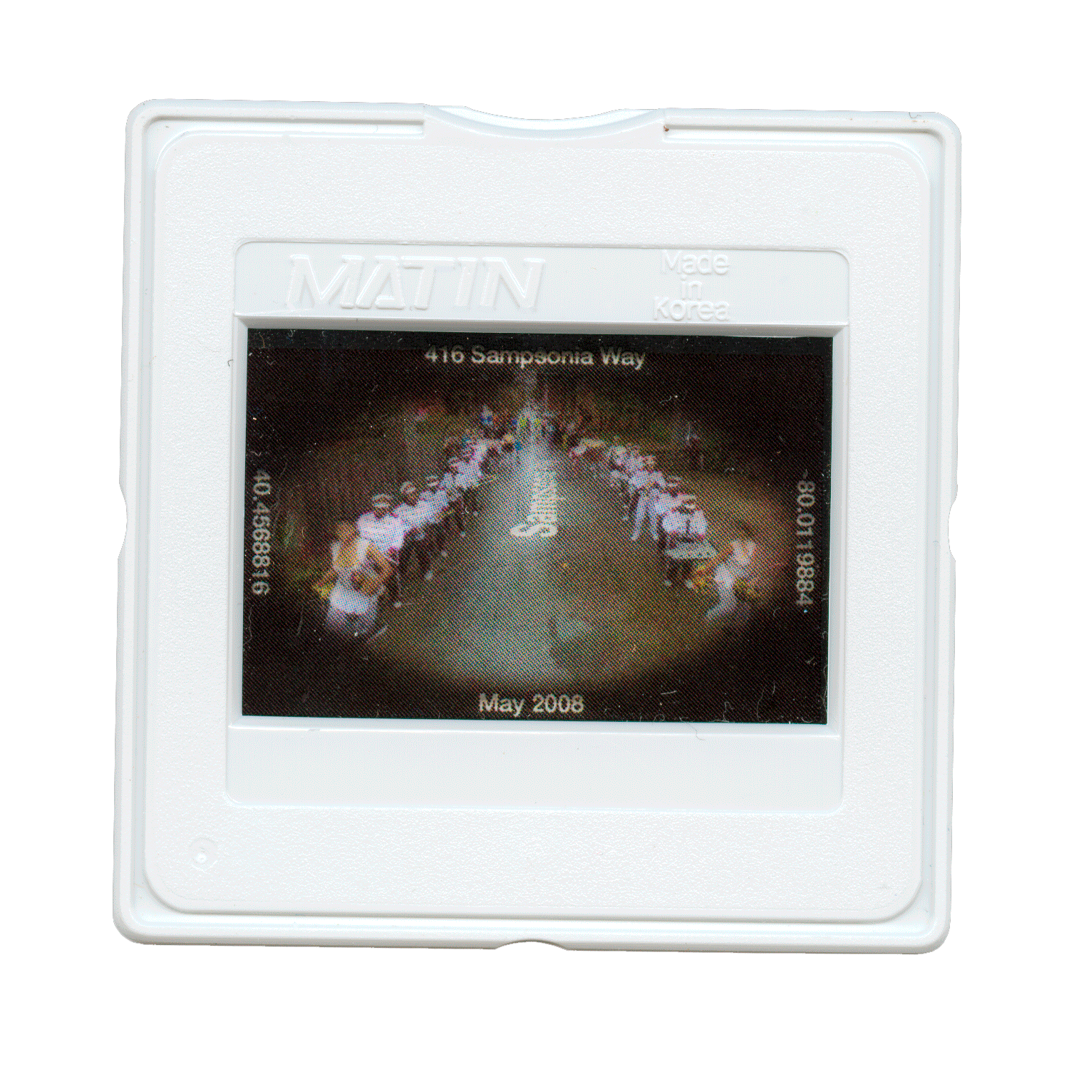
The intriguing moments displayed on Frozen Island were printed on 35mm film slides as well. The slides are the layers of frozen time. Just like looking at a sample under a microscope, you can observe the frozen time more closely under a slide viewer.
I don’t like being in a closed space because the space represents the restriction of freedom. I assume that I’m not the only one who doesn’t like it. Many countries still have travel restrictions due to the pandemic or even because of the ongoing war in Ukraine. This project strives to reclaim mobility and recover a sense of community.
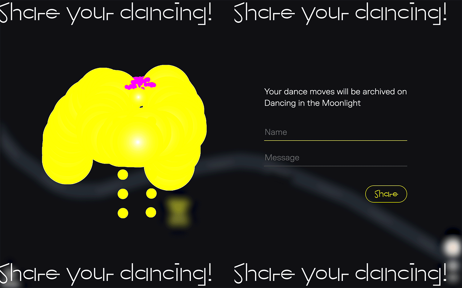
When users drop the Google Maps avatar onto the place they want to go, they can dance at that location with music while traversing virtual streets. Anyone can record and share their dance moves as well as dance together with other users.
The title, “Dancing in the Moonlight,” was named after a song with the same name. Sherman Kelly wrote this song while recovering from a severe injury after being attacked by a gang.
I’ve always thought that Google Maps is the Earth in miniature. Above the earth, the moon always shines down. The avatars created by participants are shown on Google Maps in yellow as figures of moonlight. If more participants join this project, the initially dark Google Maps interface will become brighter with their individual moonlight avatars.
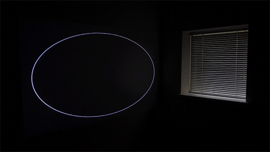
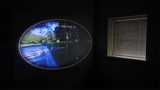
“The Portal” opens the gate to the world on the walls within your own home. Now you can go anywhere in the world by saying the names of the places you care about. This could mean your hometown that you haven't been to in a long time or a new travel destination. The portal was made from Google Maps, therefore you can traverse virtual streets in “The Portal”.
Technically, “The Portal” is not a real portal. It was made using web programming language and then projected on the wall. A smartphone is used as a controller when you traverse virtual streets on Google Maps.
However, this piece does not articulate the truth. “The Portal” is a doorway to the new world. It is a piece about pursuing freedom under restrictions. By tweaking the truth, “The Portal” generates magic and makes our lives more fun and pleasurable.
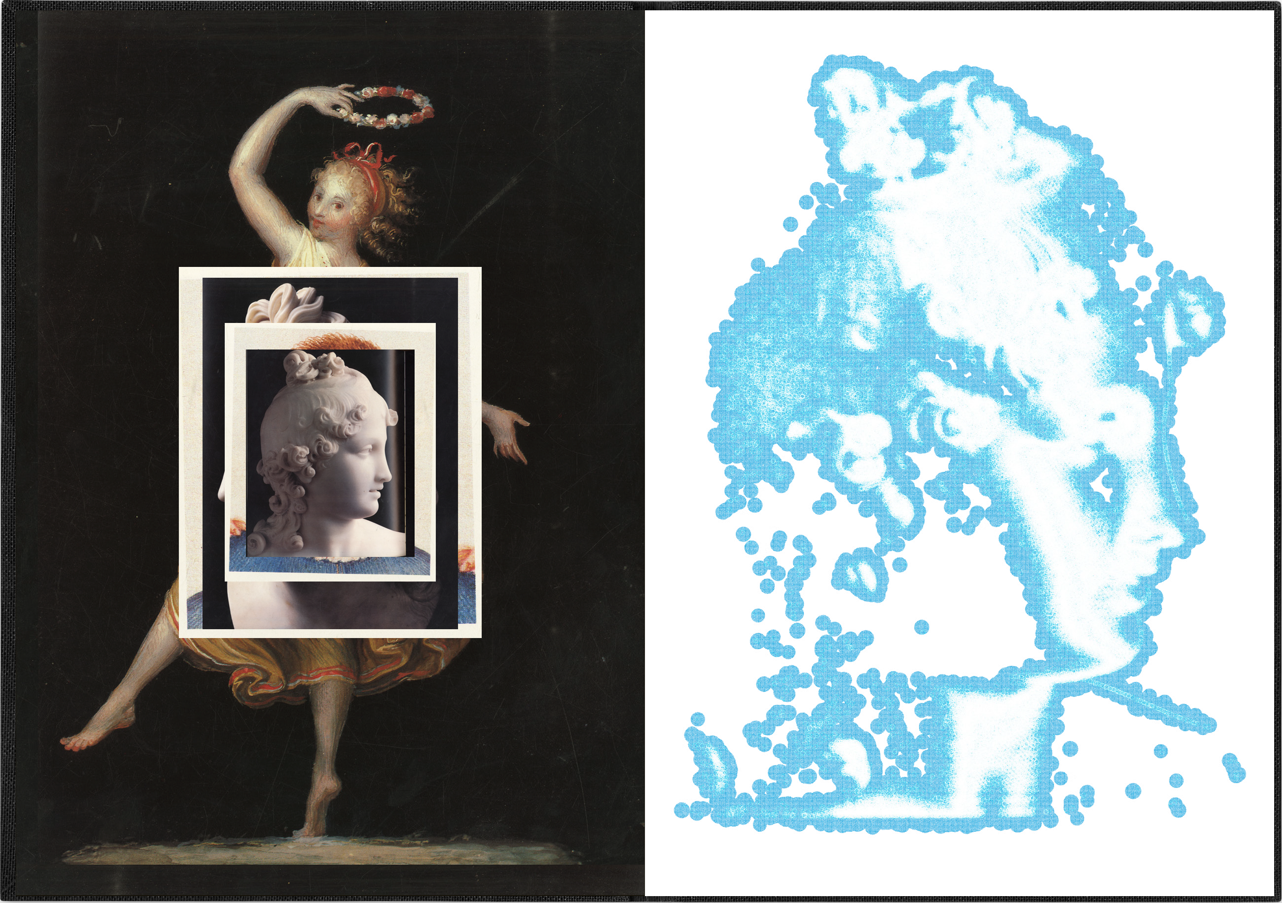
The facial expressions of the generated images reminded me of the sense of madness I felt when watching “Game of Thrones.” As a result, I named my book after the original novel behind the TV series — “A Song of Ice and Fire.”
I put the pixelated cat generated by "Nemo Nemo" onto my MacBook touch bar to create a motion poster.


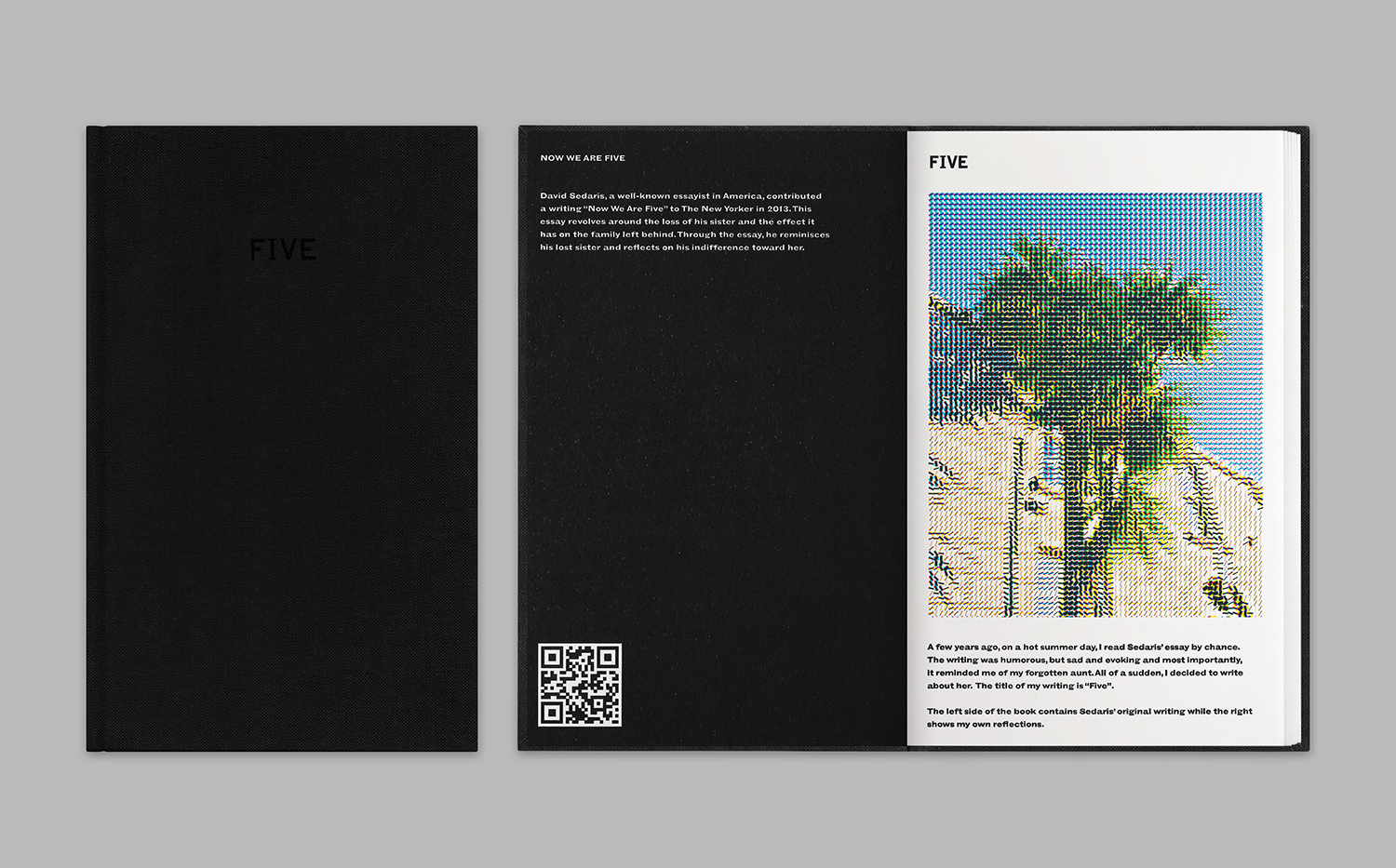
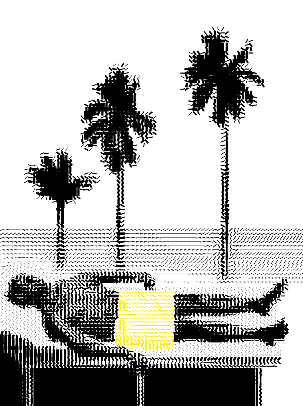
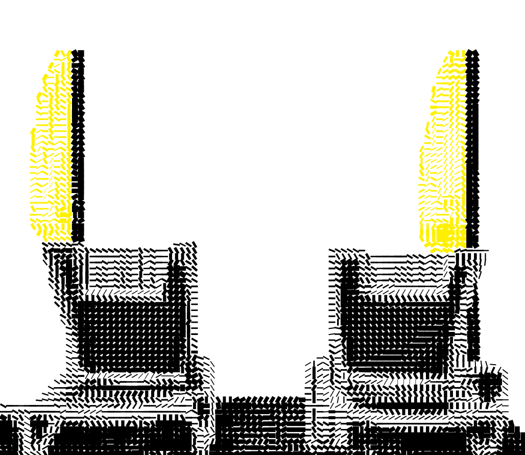
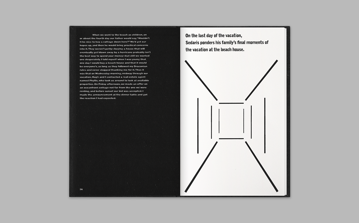
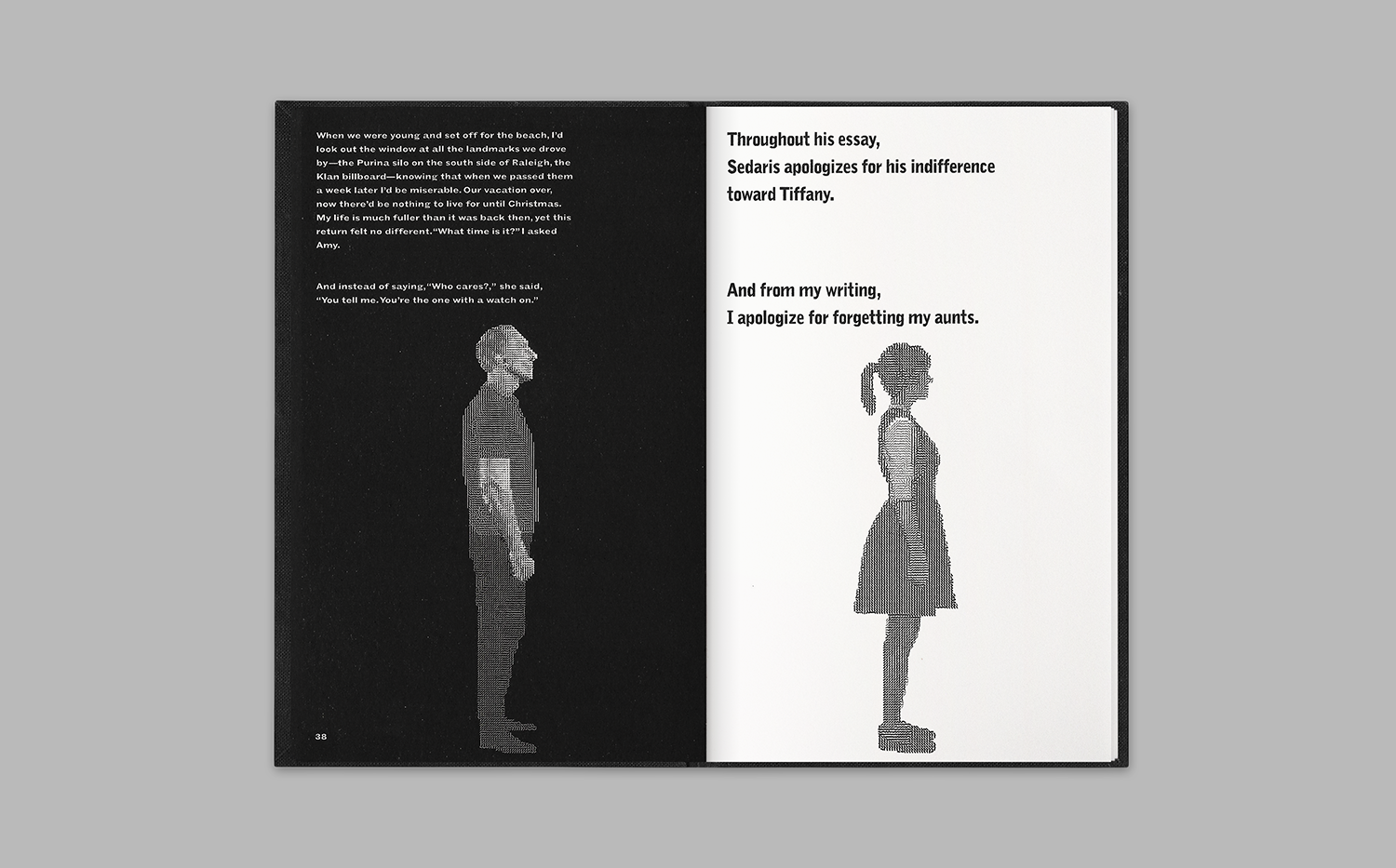
Throughout “Now We Are Five”, Sedaris apologizes for his indifference toward Tiffany. In my writing, "Five”, I apologize for forgetting my aunts.
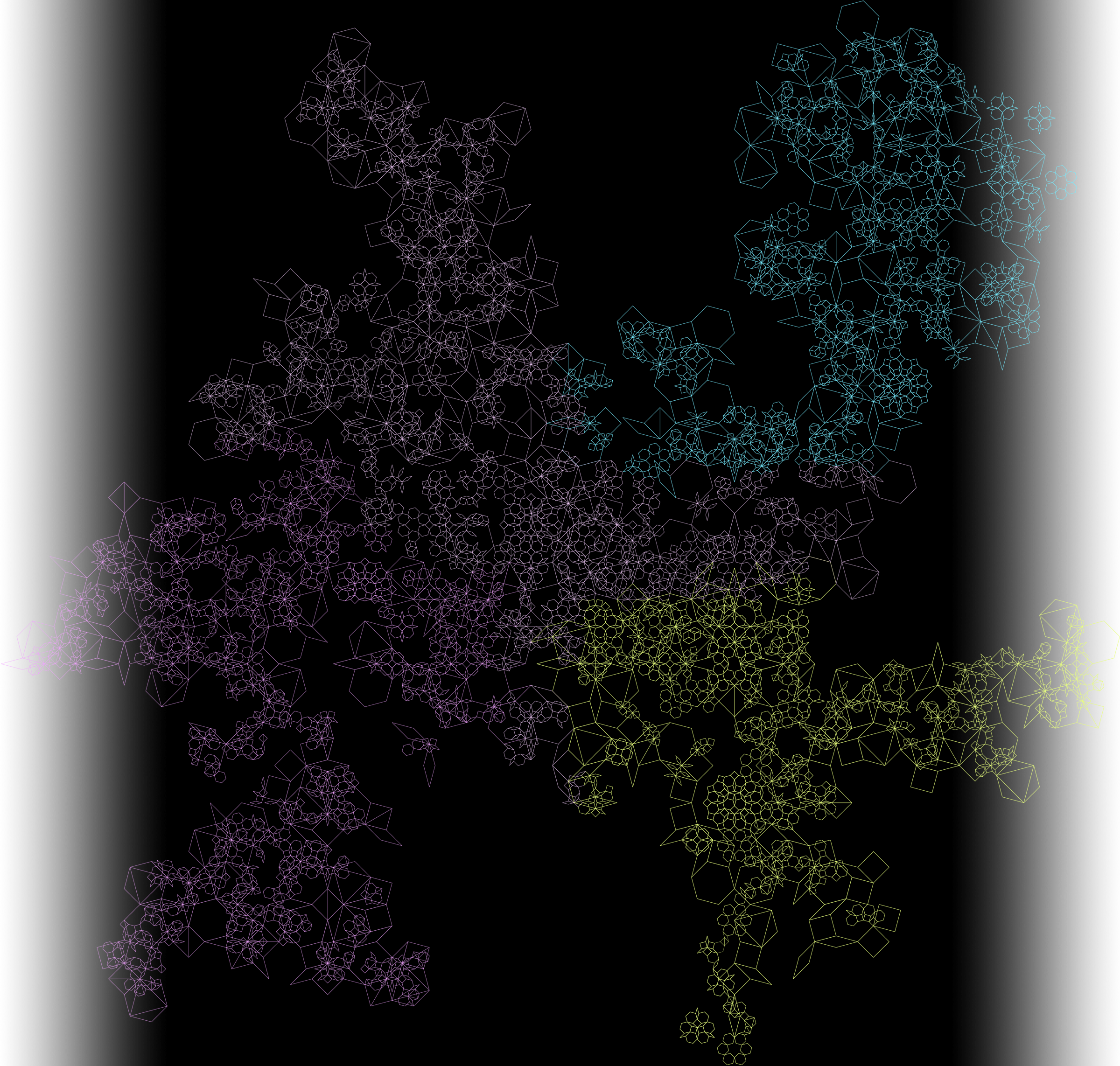
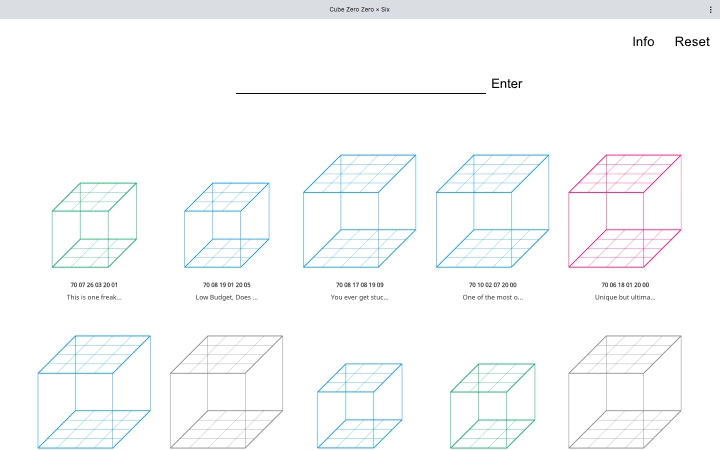
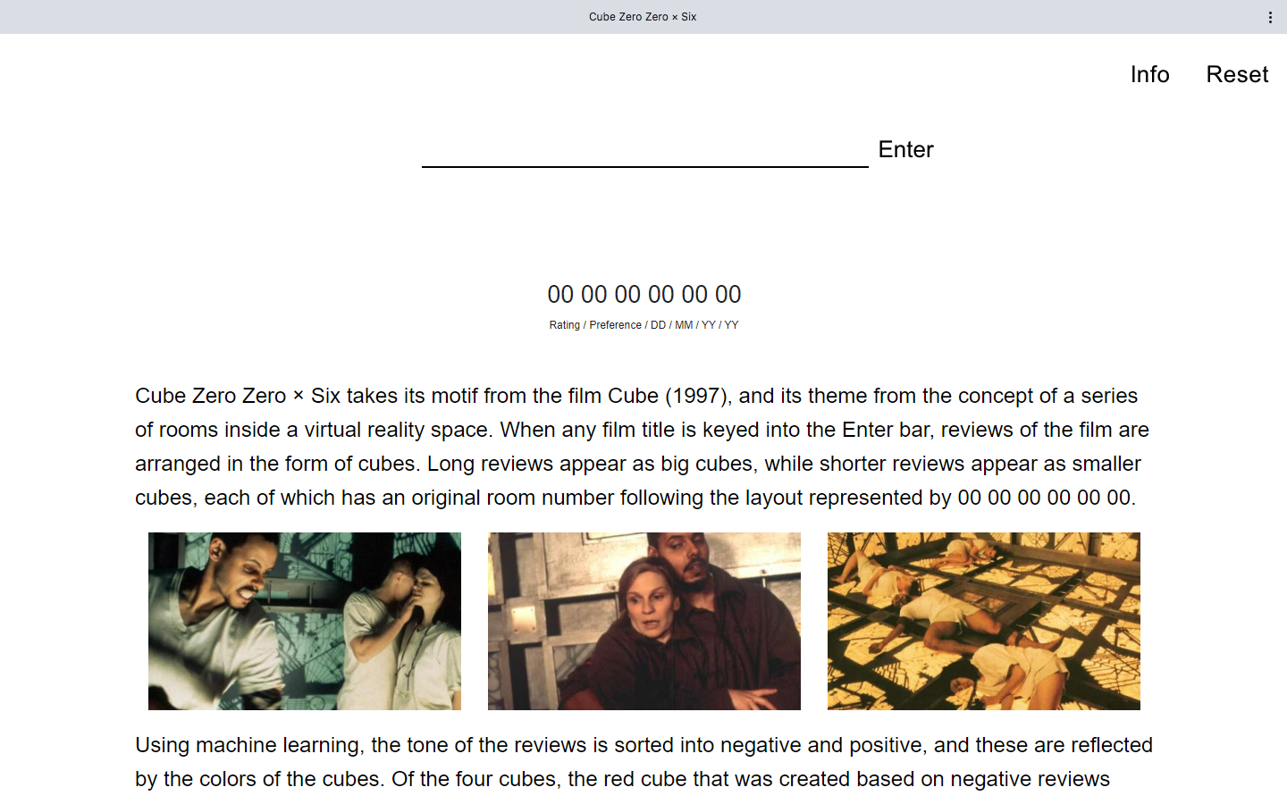
When users type any film title on the search bar, reviews of the film are sorted into negative and positive categories by machine learning. While positive reviews are represented as blue cubes, negative reviews are shown as red cubes.
Based on the web data, Cube Zero Zero × Six continuously grows as an artificial web organism.


This Archive is linked to my –Are.na channel — images or videos related to processes, drafts, ongoing work, exhibitions, and other activities are occasionally uploaded.